Study
Build a Responsive Website | HTML, CSS Grid, Flexbox & More
Credits / Notes taken from:
Don’t forget to have Live Server extension installed on Visual Code (access website after with http://127.0.0.1:5500/).
https://stackoverflow.com/questions/30557915/is-it-good-idea-to-make-separate-css-file-for-each-html-page - actually no :cry:.
Contents
-
[Build a Responsive Website HTML, CSS Grid, Flexbox & More](#build-a-responsive-website–html-css-grid-flexbox–more) - Index.html page
- Solutions.html page
- Documentation html page
- Media Queries for Solutions and Docs page
- Homepage Animation
- Complete Code
HTML Template, Boilerplate
We can use cdnjs.com to insert all our links (css, javascript) to utilities/libraries (like Font-Awesome).
Link to Google Fonts - Preferable font: Light 300.
Best 30 Google Fonts for a Website
<!DOCTYPE html>
<html lang="en">
  <head>
    <meta charset="UTF-8" />
    <meta name="viewport" content="width=device-width, initial-scale=1.0" />
    <link rel="stylesheet" href="css/style.css" />
    <link
      rel="stylesheet"
      href="https://cdnjs.cloudflare.com/ajax/libs/font-awesome/5.15.1/css/all.min.css"
      integrity="sha512-+4zCK9k+qNFUR5X+cKL9EIR+ZOhtIloNl9GIKS57V1MyNsYpYcUrUeQc9vNfzsWfV28IaLL3i96P9sdNyeRssA=="
    />
    <title>Qualia Soft | Software Solutions for Everyone</title>
  </head>
  <body>
    <!-- Navbar: Logo and Navigation -->
    <div class="navbar">
      <div class="container">
        <h1 class="logo">Qualia Soft</h1>
        <nav>
          <ul>
            <li><a href="index.html">Home</a></li>
            <li><a href="solutions.html">Solutions</a></li>
            <li><a href="docs.html">Documentation</a></li>
          </ul>
        </nav>
      </div>
    </div>

    <!-- Showcase -->
    <section class="showcase">
      <div class="container grid"></div>
    </section>

    <!-- Stats -->
    <section class="stats">
      <div class="container"></div>
    </section>

    <!-- Solutions -->
    <section></section>

    <!-- Technologies -->
    <section></section>

    <!-- Footer -->
    <footer></footer>
  </body>
</html>
CSS File
CSS Boilerplate
First thing we need to do in our style.css
* {
  box-sizing: border-box;
  padding: 0;
  margin: 0;
}
box-sizing allows us to add padding, borders without having to add width to the elements. Also, by default HTML has padding and margin in our body and a lot of other elements… so we need to overwrite them with zero first.
Then we need to set our font family to our body:
body {
  font-family: "Montserrat", sans-serif;
  color: #333;
  line-height: 1.6;
}
Then we must make sure we don’t have any bullet points for lists (eg. navbar), and we also need to get rid of the ugly underlines for links:
ul {
  list-style-type: none;
}

a {
  text-decoration: none;
  color: #333;
}
And we also modify
- the headings and paragraphs (margin top and bottom 10px, left and right 0px)
- images size so they’ll be kept within their containers (even if it’s a large image)
h1,
h2 {
  font-weight: 300;
  line-height: 1.2;
  margin: 10px 0;
}

p {
  margin: 10px 0;
}

img {
  width: 100%;
}
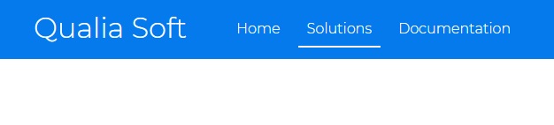
Styling the Navbar
HTML:
<div class="navbar">
  <div class="container flex">
    <h1 class="logo">Qualia Soft</h1>
    <nav>
      <ul>
        <li><a href="index.html">Home</a></li>
        <li><a href="solutions.html">Solutions</a></li>
        <li><a href="docs.html">Documentation</a></li>
      </ul>
    </nav>
  </div>
</div>
CSS:
/* Navbar */
.navbar {
  background-color: #047aed;
  color: #fff;
  height: 70px;
}

.container {
  max-width: 1100px;
  margin: 0 auto;
  overflow: auto;
  padding: 0 40px;
}
max-width: 1100px; will retain the navbar in the center (so it doesn’t get stretched out to the edge of the screen)
Because the h1 header has a margin top of 10px (we set that earlier), our navbar will not be at the top of the page, we can fix that with overflow: auto;
We also add ` padding: 0 40px;` (0px for top and bottom, 40px for top and right)

Now we’ll use flexbox to arrange our navbar links. But we don’t want to apply flexbox to the whole container itself, so we added another CSS class in our HTML called “flex” (<div class="container flex">) which we are going to create a CSS class for.
.flex {
  display: flex;
}
If we want our navbar to be centered (logo centered and links) we can add justify-content: center;, and if we want to align them vertically: align-items: center;
However, we’ll use the .flex class as a general purpose flexbox container (where we keep justify-content: center;), so we’ll make another declarations for navbar, like this:
/* Navbar */
.navbar {
  background-color: #047aed;
  color: #fff;
  height: 70px;
}

.navbar .flex {
  justify-content: space-between;
}

.container {
  max-width: 1100px;
  margin: 0 auto;
  overflow: auto;
  padding: 0 40px;
}

.flex {
  display: flex;
  justify-content: center;
  align-items: center;
  height: 100%;
}
Now, time to work on the links:
.navbar ul {
  display: flex;
}
.navbar ul { display: flex; } will display the links in the navbar horizontally (as we wanted)
.navbar ul {
  display: flex;
}

.navbar a {
  color: #fff;
  padding: 10px;
  margin: 0 5px;
}

.navbar a:hover {
  border-bottom: 2px #fff solid;
}
Already looks good:
Note: So far we will make the website responsive for desktop first.
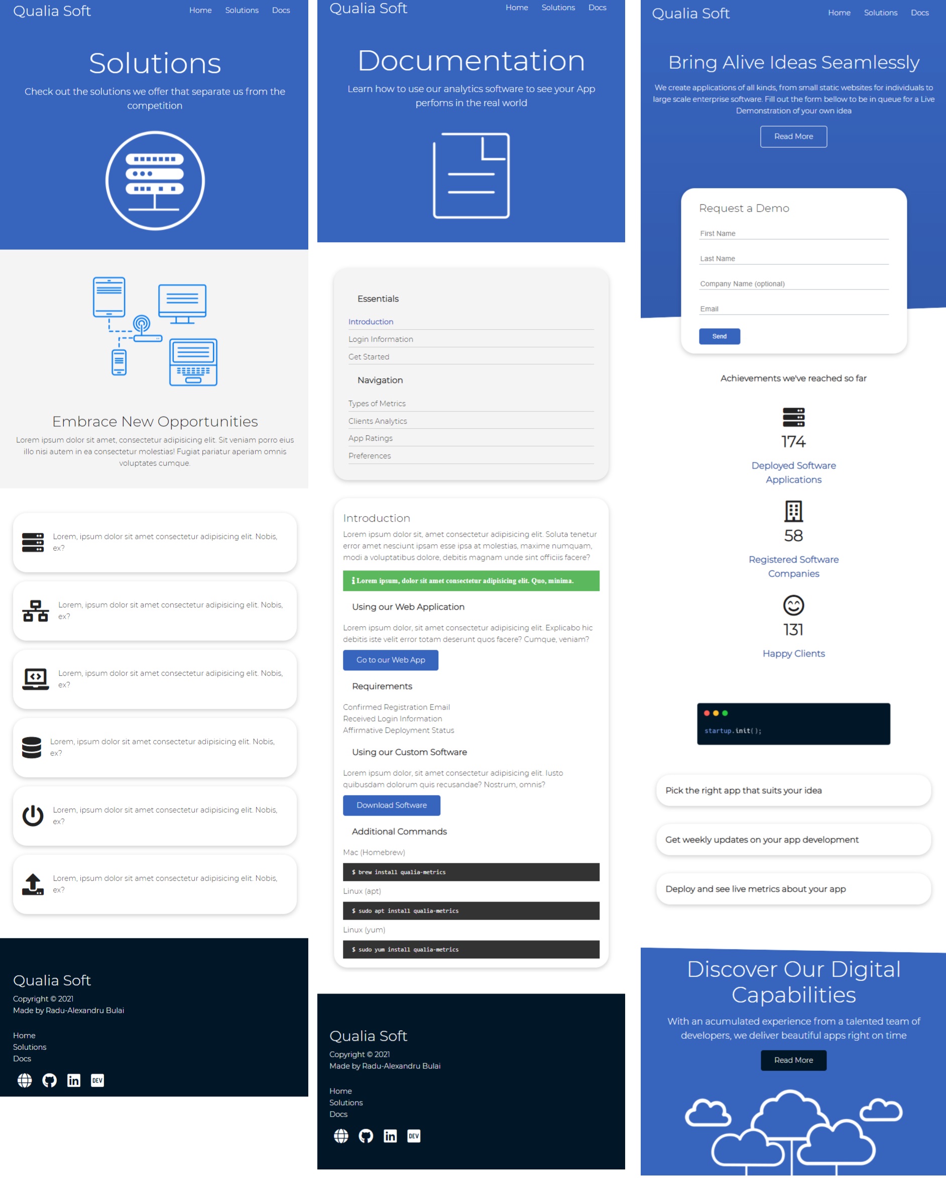
Index.html page
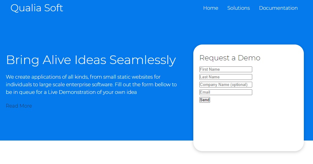
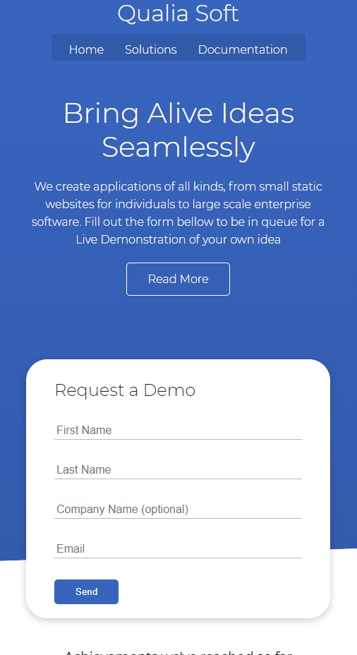
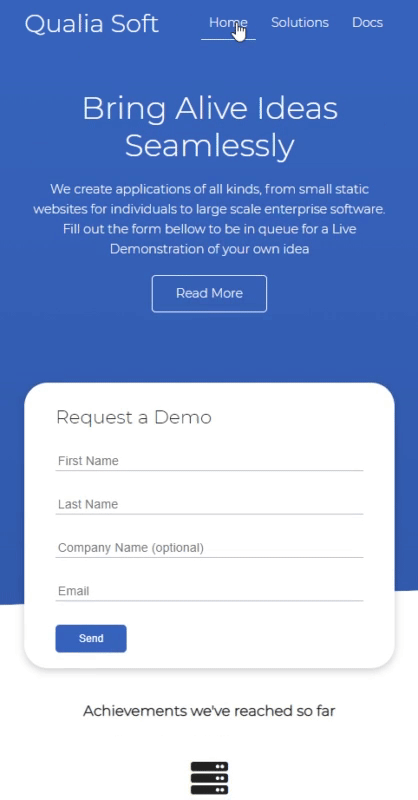
Showcase section
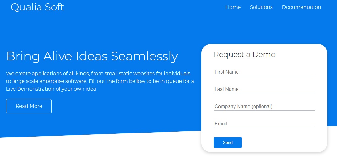
<!-- Showcase | Hero Section -->
<section class="showcase">
  <div class="container grid">
    <div class="showcase-text">
      <h1>Bring Alive Ideas Seamlessly</h1>
      <p>
        We create applications of all kinds, from small static websites for
        individuals to large scale enterprise software. Fill out the form bellow
        to be in queue for a Live Demonstration of your own idea
      </p>
      <a href="solutions.html" class="btn btn-outline">Read More</a>
    </div>

    <div class="showcase-form card">
      <h2>Request a Demo</h2>
      <form>
        <div class="form-control">
          <input
            type="text"
            name="first_name"
            placeholder="First Name"
            required
          />
        </div>
        <div class="form-control">
          <input
            type="text"
            name="last_name"
            placeholder="Last Name"
            required
          />
        </div>
        <div class="form-control">
          <input
            type="text"
            name="company_name"
            placeholder="Company Name (optional)"
          />
        </div>
        <div class="form-control">
          <input type="email" name="email" placeholder="Email" required />
        </div>
        <input type="submit" value="Send" class="btn btn-primary" />
      </form>
    </div>
  </div>
</section>
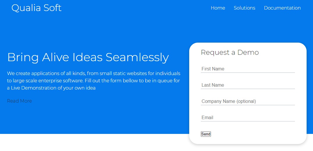
Now, time to add some CSS: (Sunday, January 10, 2021, 17:20)
.showcase {
  height: 400px;
  background-color: var(--primary-color);
  color: #fff;
  position: relative;
}
We use position: relative; so that we can place elements inside that have a position of absolute
/* Showcase | Hero Section*/
.showcase {
  height: 400px;
  background-color: var(--primary-color);
  color: #fff;
  position: relative;
}

.showcase h1 {
  font-size: 40px;
}

.showcase p {
  margin: 20px 0;
}
For our two items (<div class="showcase-text"> and <div class="showcase-form card">) within our <section class="showcase"> <div class="container grid">, we want to display them in grid on two separate columns (for desktop view, we will later adjust them to display as rows for mobile).
.grid {
  display: grid;
  grid-template-columns: 1fr 1fr;
  gap: 20px;
  justify-content: center;
  align-items: center;
  height: 100%;
}
Note that align-items: center; with a grid will not align items vertically (yet) unless we mention a height property.
We can now customize our grid even further for by adding a new CSS grid class within .showcase:
.showcase .grid {
  grid-template-columns: 60% 40%;
  gap: 30px;
}
Form Card Layout
Now let’s make a card like layout for our form
<!-- HMTL -->
<div class="showcase-form card"></div>
.card {
  background-color: #fff;
  color: var(--font-color);
  border-radius: 30px;
  box-shadow: 0 3px 10px rgba(0, 0, 0, 0.2);
  padding: 20px;
  margin: 10px;
}
Perfect.
Now let’s customize our Form
First, we need to set position: relative; to our form in order to use top (or right, bottom, left) properties. We are going to push down the form 60px by setting top: 60px;
Then we can set height: 350px; to have the form going outside the container, but we’ll need to also set in our .showcase .grid class the overflow: visible; in order to hide the scrollbar that will appear for that form.
.showcase .grid {
  grid-template-columns: 60% 40%;
  gap: 30px;
  overflow: visible;
}

.showcase-form {
  position: relative;
  top: 60px;
  height: 350px;
}
We can also add z-index: 100; to make sure our form will always show in front of other elements (it is useful for the time we will use animations and keyframes, for having the both items showcase-text and showcase-form coming from sides - for left and from right).
We also add justify-self: flex-end to push the form to the right.
.showcase-form {
  position: relative;
  top: 60px;
  height: auto;
  width: 100%;
  padding: 20px 40px;
  z-index: 100;
  justify-self: flex-end;
}
Form Customize Inputs
Continuing to customize our Form
We’ll add margin: 30px 0; (margin top and bottom to 30px) to separate (horizontally) each input in our form
However, if we target showcase-form input we will also target the button, so in order to style our inputs, we’ll put input[type='text']
.showcase-form .form-control {
  margin: 30px 0;
}

.showcase-form input[type="text"],
.showcase-form input[type="email"] {
  border: 0;
  border-bottom: 1px solid #b4becb;
  width: 100%;
  padding: 3px;
  font-size: 16px;
}

.showcase-form input:focus {
  outline: none;
}
We overwrite the default border cassettes around each input with border: 0;, but we add a border-bottom to have a nice separation. We’ll set width: 100%; to make sure the inputs don’t go outside the container (card).
We’d also want to get rid of the default border that appears when user clicks the form (focus): .showcase-form input:focus {outline: none;}
Customize Buttons
Now, styling the buttons - Sunday, January 10, 2021, 18:23
<!-- HTML -->
<a href="solutions.html" class="btn btn-outline">Read More</a>
<input type="submit" value="Send" class="btn btn-primary" />
We will add .btn class (the base button style for the webpage) as our CSS utility classes
display: inline-block; will work for both buttons and links, in order to make arrange them as inline blocks.
We’ll set cursor: pointer; to show a pointer when user is hovering over the button (or link with btn class)
We’ll get rid of default border around it
We’ll also add a separate class btn-outline that we can apply to other buttons (customize them)
.btn {
  display: inline-block;
  padding: 10px 30px;
  cursor: pointer;
  background-color: var(--primary-color);
  color: #fff;
  border: none;
  border-radius: 5px;
  transition: all 100ms;
}

.btn-outline {
  background-color: transparent;
  border: 1px #fff solid;
}

.btn:hover {
  transform: scale(0.97);
}
We also add some hover effect with .btn:hover { transform: scale(0.97); } which will animate with a transition: all 100ms;
Add Details Personality to the page
Let’s add a slant (angled edge, sloped line) to our showcase section
For this, we’ll use the :before and :after pseudo-selector classes. We can use position: absolute here because we specified position relative in our main .showcase class.
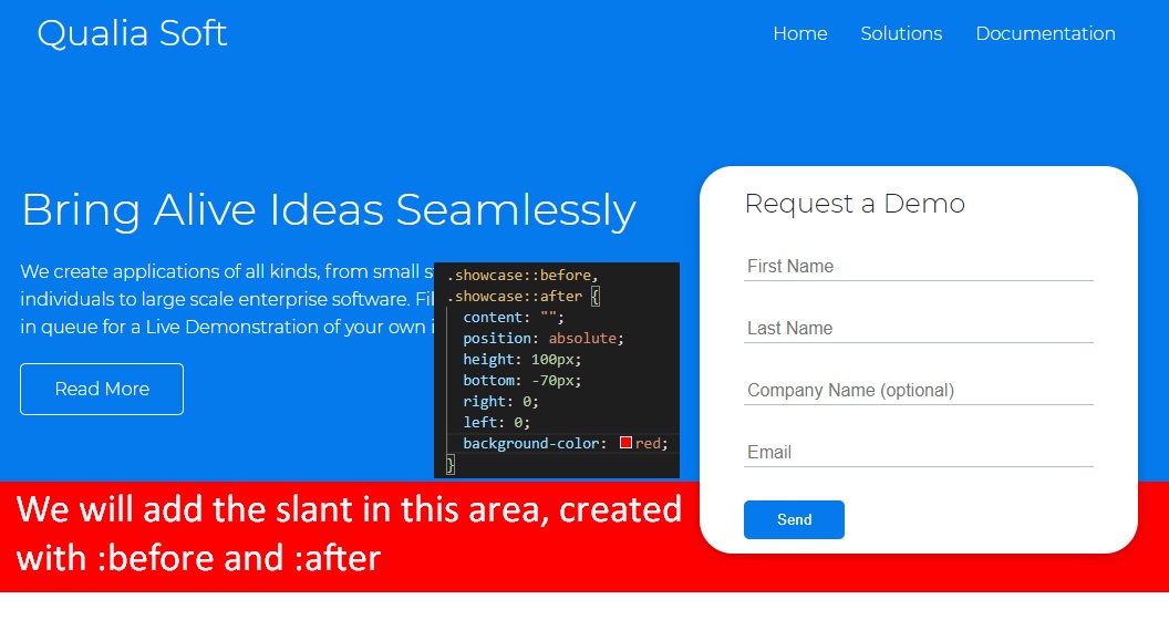
We’ll create the angled edge using transform: skewY(-3deg);, and we’ll switch back our background color to white (instead of red, as shown in example ^^)
Also, to make sure this will work on every browser, we will add -webkit-transform (Chrome and Safari), -moz-transform (Mozilla Firefox) and -ms-transform (Internet Explorer)
.showcase::before,
.showcase::after {
  content: "";
  position: absolute;
  height: 100px;
  bottom: -70px;
  right: 0;
  left: 0;
  background: #fff;
  transform: skewY(-2deg);
  -webkit-transform: skewY(-2deg);
  -moz-transform: skewY(-2deg);
  -ms-transform: skewY(-2deg);
}
All CSS Code So far
@import url("https://fonts.googleapis.com/css2?family=Montserrat:wght@300&display=swap");

:root {
  --font-color: #222;
  --primary-color: #047aed;
}

/* Overwrite HTML Defaults */
* {
  box-sizing: border-box;
  padding: 0;
  margin: 0;
}

body {
  font-family: "Montserrat", sans-serif;
  color: var(--font-color);
  line-height: 1.6;
}

ul {
  list-style-type: none;
}

a {
  text-decoration: none;
  color: var(--font-color);
}

h1,
h2 {
  font-weight: 300;
  line-height: 1.2;
  margin: 10px 0;
}

p {
  margin: 10px 0;
}

img {
  width: 100%;
}

/* Navbar */
.navbar {
  background-color: var(--primary-color);
  color: #fff;
  height: 70px;
}

.navbar .flex {
  justify-content: space-between;
}

.navbar ul {
  display: flex;
}

.navbar a {
  color: #fff;
  padding: 10px;
  margin: 0 5px;
}

.navbar a:hover {
  border-bottom: 2px #fff solid;
}

/* Utilities: Classes for reuse */
.container {
  max-width: 1100px;
  margin: 0 auto;
  overflow: auto;
  padding: 0 40px;
}

.flex {
  display: flex;
  justify-content: center;
  align-items: center;
  height: 100%;
}

.grid {
  display: grid;
  grid-template-columns: 1fr 1fr;
  gap: 20px;
  justify-content: center;
  align-items: center;
  height: 100%;
}

.card {
  background-color: #fff;
  color: var(--font-color);
  border-radius: 30px;
  box-shadow: 0 3px 10px rgba(0, 0, 0, 0.2);
  padding: 20px;
  margin: 10px;
}

.btn {
  display: inline-block;
  padding: 10px 30px;
  cursor: pointer;
  background-color: var(--primary-color);
  color: #fff;
  border: none;
  border-radius: 5px;
  transition: all 100ms;
}

.btn-outline {
  background-color: transparent;
  border: 1px #fff solid;
}

.btn:hover {
  transform: scale(0.97);
}

/* Showcase | Hero Section */
.showcase {
  position: relative;
  height: 400px;
  background-color: var(--primary-color);
  color: #fff;
}

.showcase h1 {
  font-size: 40px;
}

.showcase p {
  margin: 20px 0;
}

.showcase .grid {
  grid-template-columns: 60% 40%;
  gap: 30px;
  overflow: visible;
}

.showcase-form {
  position: relative;
  top: 60px;
  height: auto;
  width: 100%;
  padding: 20px 40px;
  z-index: 100;
  justify-self: flex-end;
}

.showcase-form .form-control {
  margin: 30px 0;
}

.showcase-form input[type="text"],
.showcase-form input[type="email"] {
  border: 0;
  border-bottom: 1px solid #b4becb;
  width: 100%;
  padding: 3px;
  font-size: 16px;
}

.showcase-form input:focus {
  outline: none;
}

.showcase::before,
.showcase::after {
  content: "";
  position: absolute;
  height: 100px;
  bottom: -70px;
  right: 0;
  left: 0;
  background: #fff;
  transform: skewY(-2deg);
  -webkit-transform: skewY(-2deg);
  -moz-transform: skewY(-2deg);
  -ms-transform: skewY(-2deg);
}
—
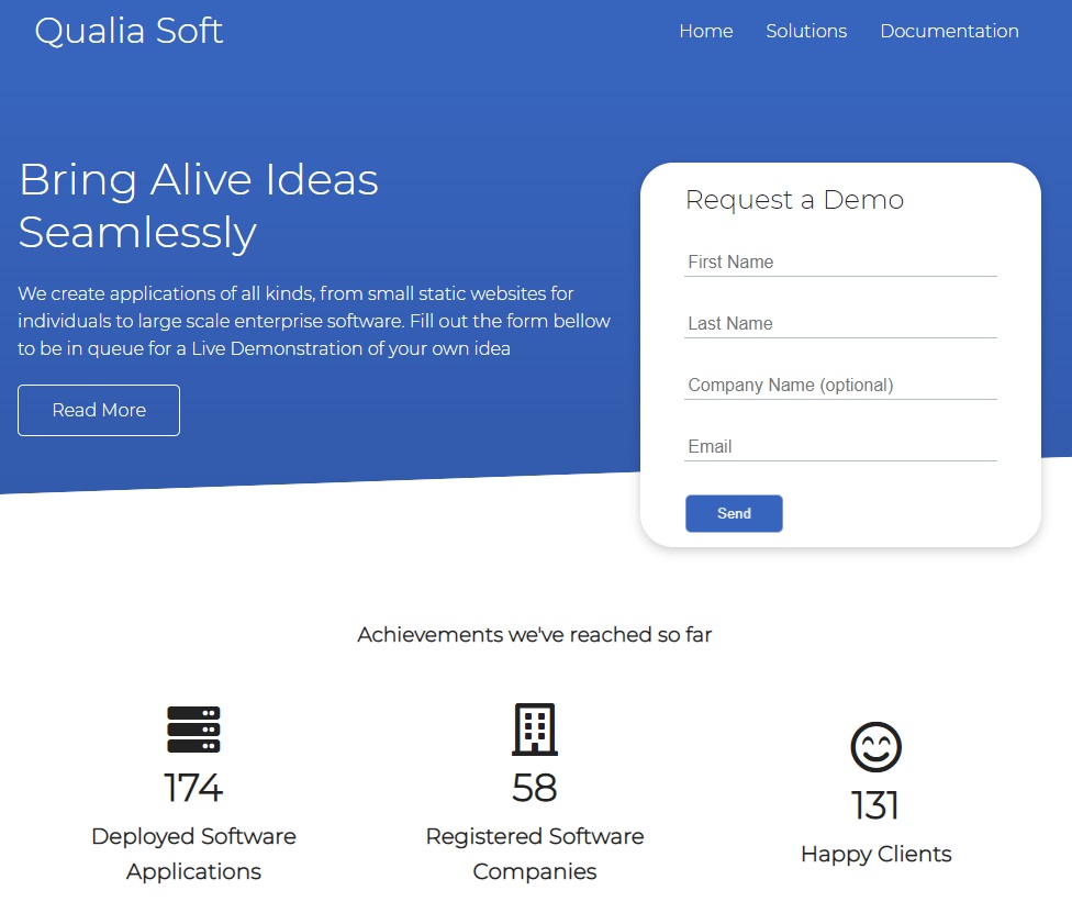
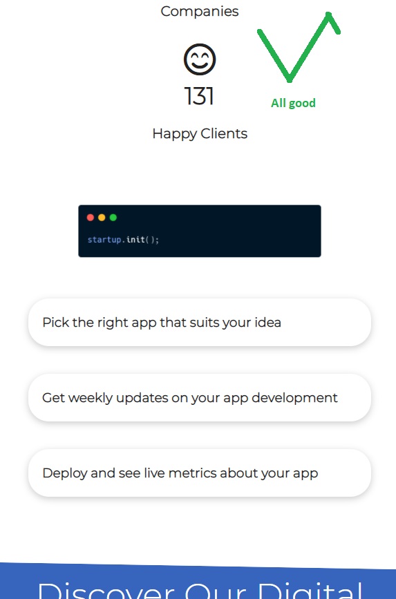
Stats section
<!-- HTML -->
<!-- Stats -->
<section class="stats">
  <div class="container">
    <h3 class="stats-heading text-center my-1">
      Achievements we've reached so far
    </h3>

    <div class="grid grid-3 text-center my-4">
      <div>
        <i class="fas fa-server fa-3x"></i>
        <h3>174</h3>
        <p class="text-secondary">Deployed Software Applications</p>
      </div>
      <div>
        <i class="far fa-building fa-3x"></i>
        <h3>58</h3>
        <p class="text-secondary">Registered Software Companies</p>
      </div>
      <div>
        <i class="far fa-smile-beam fa-3x"></i>
        <h3>131</h3>
        <p class="text-secondary">Happy Clients</p>
      </div>
    </div>
  </div>
</section>
text-center will be a class for centering text only.my-1 will be a class for margin in top and bottom (y name is for y-axis, vertically). These will be all utility classes in order to help with css and reduce manually adding margin and padding to each css of an element (remember that rem units represent the current text-size multiplied by specified number - relative to font-size of the root element).
We’ll also have a separate grid-3 class
Note: we can seamlessly create font-awesome icons with Emmet, just by writing i.fas.fa-server.fa-3x which will autocomplete to <i class="fas fa-server fa-3x"></i>
We’ll create a text-secondary class
Let’s get into CSS
/* Utilities: Classes for reuse */
.grid-3 {
  grid-template-columns: repeat(3, 1fr);
}

.text-center {
  text-align: center;
}

/* Utilities: Margins */
/* Margins for top and bottom */
.my-1 {
  margin: 1rem 0;
}
.my-2 {
  margin: 1.5rem 0;
}
.my-3 {
  margin: 2rem 0;
}
.my-4 {
  margin: 3rem 0;
}
.my-5 {
  margin: 4rem 0;
}

/* Margins for all around */
.m-1 {
  margin: 1rem;
}
.m-2 {
  margin: 1.5rem;
}
.m-3 {
  margin: 2rem;
}
.m-4 {
  margin: 3rem;
}
.m-5 {
  margin: 4rem;
}

/* Paddings for top and bottom */
.py-1 {
  padding: 1rem 0;
}
.py-2 {
  padding: 1.5rem 0;
}
.py-3 {
  padding: 2rem 0;
}
.py-4 {
  padding: 3rem 0;
}
.py-5 {
  padding: 4rem 0;
}

/* Paddings for all around */
.p-1 {
  padding: 1rem;
}
.p-2 {
  padding: 1.5rem;
}
.p-3 {
  padding: 2rem;
}
.p-4 {
  padding: 3rem;
}
.p-5 {
  padding: 4rem;
}
Ok we almost created our own framework with these utility classes.
Note that we can separate the style.css file into two files: style.css and utilities.css, and add it into our index.html with <link rel="stylesheet" href="css/utilities.css" />. But beware that the order of classes in CSS matters, so, when we are adding the two files to index.html we need to import these in this order (the utilities will be first, because we will sometimes overwrite over them!)
<head>
  <link rel="stylesheet" href="css/utilities.css" />
  <link rel="stylesheet" href="css/style.css" />
</head>
Now for the Stats Section:
/* Stats Section */
.stats {
  padding-top: 100px;
}

.stats-heading {
  max-width: 500px;
  margin: auto;
}

.stats .grid h3 {
  font-size: 35px;
}

.stats .grid p {
  font-size: 20px;
  font-weight: bold;
}
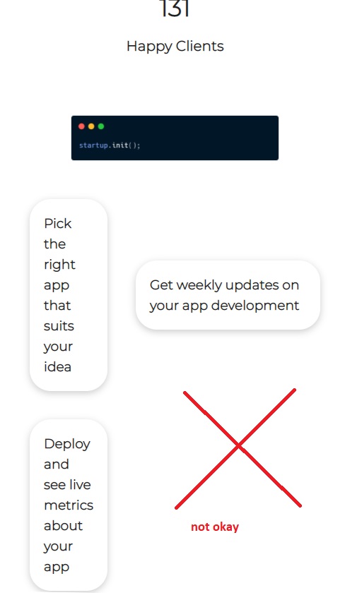
Steps CLI section
<!-- HTML -->
<!-- Solutions -->
<section class="steps">
  <div class="container grid">
    <img src="images/cli.png" alt="" />
    <div class="card">
      <h3>Pick the right app that suits your idea</h3>
    </div>
    <div class="card">
      <h3>Get weekly updates on your app development</h3>
    </div>
    <div class="card">
      <h3>Deploy and see live metrics about yout app</h3>
    </div>
  </div>
</section>
For this section, we want two have a grid with 2 columns, but then each column (on the right) will have multiple rows. So, we want to have two columns, 3 rows, but we the first column to span over the 3 rows.
One solution for this can be to actually make multiple items as grid themselves, then we would have a grid within a grid. However, we can also just select the first item (as first child) to span over the entire first column.
… However we can make this even interesting: we will have 3 columns and 3 rows, and we’d want to span (extend) the first child over the first two columns, and over the three rows.
/* Solutions CLI Section */
.steps .grid {
  grid-template-columns: repeat(3, 1fr);
  grid-template-rows: repeat(3, 1fr);
}

.steps .grid > *:first-child {
  grid-column: 1 / span 2;
  grid-row: 1 / span 3;
}
So here’s the result - Sunday, January 10, 2021, 21:58
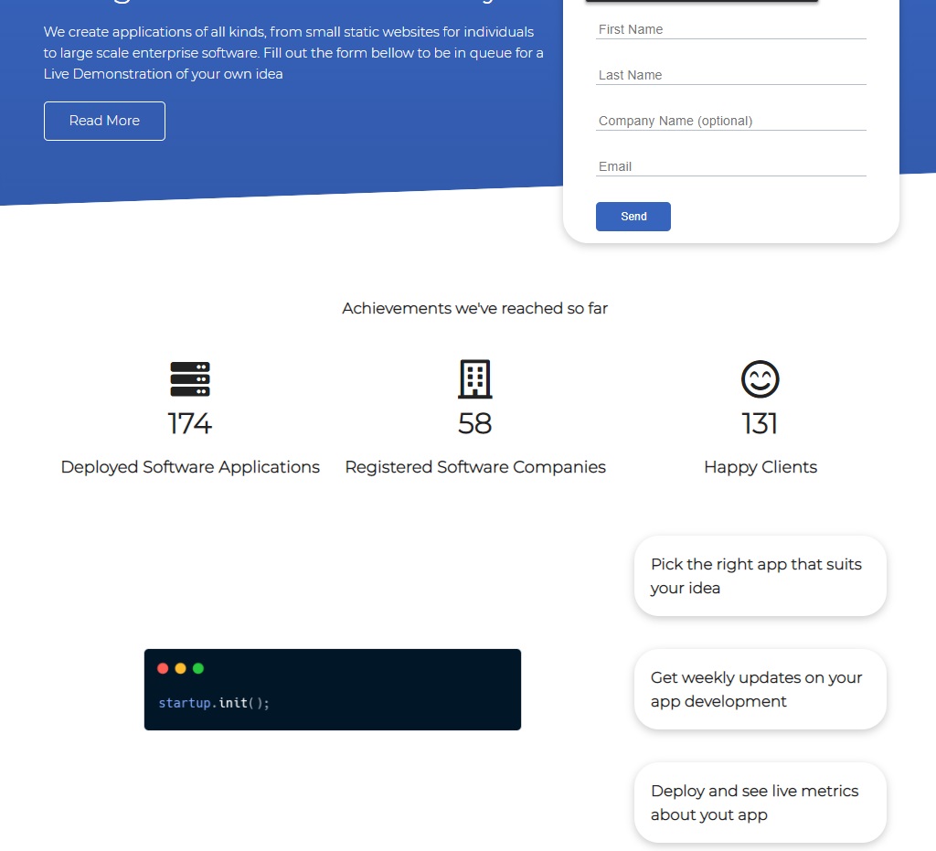
CSS Grid really makes everything easier
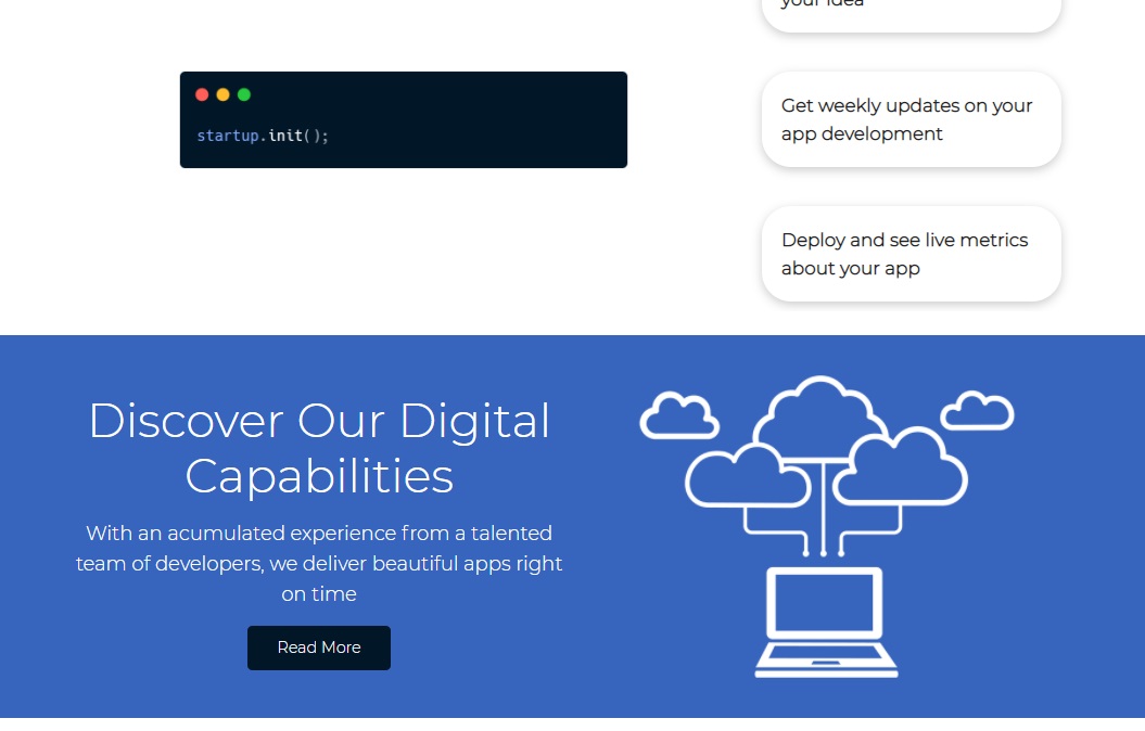
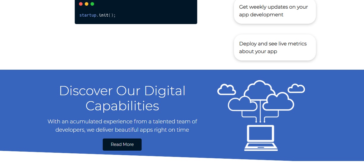
Banner section
Here we’ll make a new class called bg-primary where we’ll put our primary color as background
We’ll also used the already created utility CSS classes my-2 and py-2, and my-1
We’ll introduce a new utility class called lg (that stands for large) and another class called lead for bigger paragraphs; as well as sm (for small text-size, which will be 1rem == 16px in HTML’s default), md as medium (2rem or 32px), lg (3rem) and xl (4rem)
We’ll add another class for btn-dark
<!-- Banner -->
<section class="banner bg-primary my-2 py-2">
  <div class="container grid">
    <div class="text-center">
      <h2 class="lg">Discover Our Digital Capabilities</h2>
      <p class="lead my-1">
        With an acumulated experience from a talented team of developers, we
        deliver beautiful apps right on time
      </p>
      <a href="solutions.html" class="btn btn-dark">Read More</a>
    </div>
    <img src="images/cloud.png" alt="" />
  </div>
</section>
Now for the CSS part
We can also have the following variables for our colors:
/* style.css */
:root {
  --font-color: #222;
  --primary-color: #3764bd;
  --secondary-color: #325aac;
  --dark-color: #011627;
  --light-color: #83bceb;
}
Utility classes:
/* utilities.css */
/* Backgrounds & colored buttons */
.bg-primary,
.btn-primary {
  background-color: var(--primary-color);
  color: #fff;
}

.btn-secondary,
.bg-secondary {
  background-color: var(--secondary-color);
  color: #fff;
}

.bg-dark,
.btn-dark {
  background-color: var(--dark-color);
  color: #fff;
}

.btn-light,
.bg-light {
  background-color: var(--light-color);
  color: var(--font-color);
}

/* Text sizes */
.lead {
  font-size: 20px;
}
.sm {
  font-size: 1rem;
}
.md {
  font-size: 2rem;
}
.lg {
  font-size: 3rem;
}
.xl {
  font-size: 4rem;
}
.text-center {
  text-align: center;
}
Our section’s CSS
/* style.css */
/* Banner Section */
.banner .grid {
  grid-template-columns: 4fr 3fr;
}
And voila:
Even if the tutorial at 1h5m ends here with this section… I’ve decided to go a step further and and a slant (angled edge) like we did on the Showcase / Hero section.
Let’s add slant (angled edge) here too

Here’s the entire CSS part for our Banner Section
/* style.css */
/* Banner Section */
.banner .grid {
  grid-template-columns: 4fr 3fr;
}

.banner {
  position: relative;
}

.banner::before,
.banner::after {
  content: "";
  position: absolute;
  height: 75px;
  bottom: -60px;
  right: 0;
  left: 0;
  background: #fff;
  transform: skewY(2deg);
  -webkit-transform: skewY(2deg);
  -moz-transform: skewY(2deg);
  -ms-transform: skewY(2deg);
}
Oook or maybe we can put the sloped edge before our section (replace bottom with top):
.banner::before,
.banner::after {
  content: "";
  position: absolute;
  height: 65px;
  top: -45px;
  right: 0;
  left: 0;
  background: #fff;
  transform: skewY(2deg);
  -webkit-transform: skewY(2deg);
  -moz-transform: skewY(2deg);
  -ms-transform: skewY(2deg);
}
Oke done!
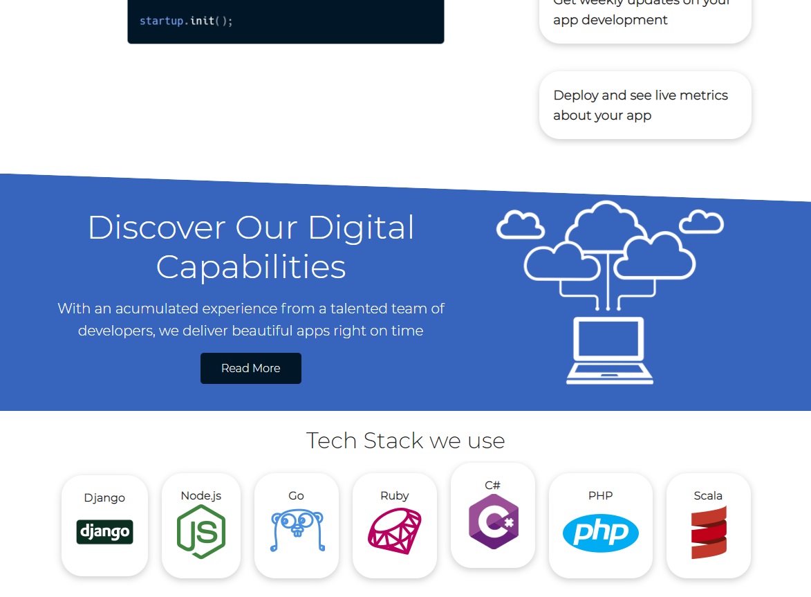
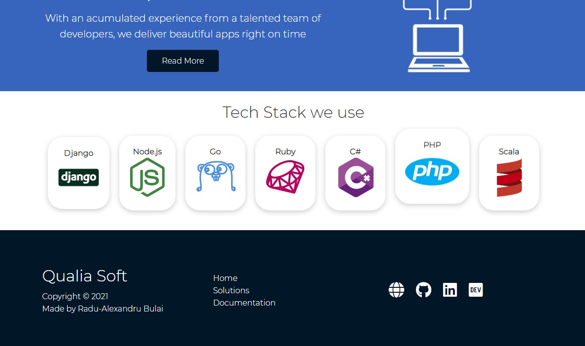
Technologies section
<!-- Technologies -->
<section class="technologies">
  <h2 class="md text-center my">Tech Stack we use</h2>
  <div class="container flex">
    <div class="card">
      <h4>Django</h4>
      <img src="images/logos/django.png" alt="" />
    </div>
    <div class="card">
      <h4>Node.js</h4>
      <img src="images/logos/node.png" alt="" />
    </div>
    <div class="card">
      <h4>Go</h4>
      <img src="images/logos/go.png" alt="" />
    </div>
    <div class="card">
      <h4>Ruby</h4>
      <img src="images/logos/ruby.png" alt="" />
    </div>
    <div class="card">
      <h4>C#</h4>
      <img src="images/logos/csharp.png" alt="" />
    </div>
    <div class="card">
      <h4>PHP</h4>
      <img src="images/logos/php.png" alt="" />
    </div>
    <div class="card">
      <h4>Scala</h4>
      <img src="images/logos/scala.png" alt="" />
    </div>
  </div>
</section>
Now for the CSS
/* Technologies Section */
.technologies .flex {
  flex-wrap: wrap;
}

.technologies .card {
  text-align: center;
  margin: 18px 10px 40px;
  transition: transform 100ms ease-in;
}

.technologies .card .h4 {
  font-size: 20px;
  margin-bottom: 10px;
}

.technologies .card:hover {
  transform: translateY(-15px);
}
We used transform: translateY(-15px); so when the user is hovering over a card, the card goes up 10px. (We don’t forget adding transition: transform 100ms; to seem more interactive / have a smoother transition)
And with transition:
…
Wait.
I have a crazy idea.
What if, instead of using a simple hover that moves the card up… what if we do an infinite bounce while the user hovers it?
After a bit of playing with animations (without any luck on finding the code already on the Internet), I came up with this:
/* Technologies Section */
.technologies .flex {
  flex-wrap: wrap;
}

.technologies .card {
  text-align: center;
  margin: 18px 10px 40px;
}

.technologies .card .h4 {
  font-size: 20px;
  margin-bottom: 10px;
}

.technologies .card:hover {
  animation-name: bounce;
  animation-duration: 250ms;
  animation-iteration-count: infinite;
  animation-direction: alternate;
  animation-timing-function: ease-out;
}

@keyframes bounce {
  0% {
    transform: translateY(0px);
  }
  100% {
    transform: translateY(-15px);
  }
}

Wonderful. (Monday, January 11, 2021, 00:00)
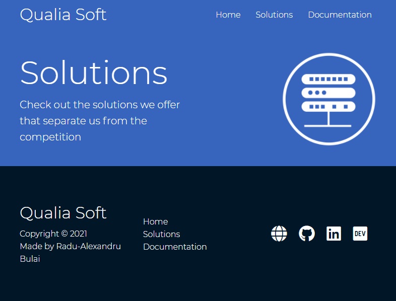
Footer section
<!-- Footer -->
<footer class="footer bg-dark py-5">
<div class="container grid grid-3">
<div>
<h1>Qualia Soft</h1>
<p>
Copyright © 2021<br />
Made by Radu-Alexandru Bulai
</p>
</div>
<nav>
<ul>
<li><a href="index.html">Home</a></li>
<li><a href="solutions.html">Solutions</a></li>
<li><a href="docs.html">Documentation</a></li>
</ul>
</nav>
<div class="social">
<a target="_blank" rel="noopener noreferrer" href="https://radubulai.com"
><i class="fas fa-globe fa-2x"></i
></a>
<a
target="_blank"
rel="noopener noreferrer"
href="https://github.com/radualexandrub"
title="GitHub"
><i class="fab fa-github fa-2x"></i
></a>
<a
target="_blank"
rel="noopener noreferrer"
href="https://www.linkedin.com/in/radu-alexandru-bulai"
><i class="fab fa-linkedin fa-2x"></i
></a>
<a
target="_blank"
rel="noopener noreferrer"
href="https://dev.to/radualexandrub"
title="Dev.to"
><i class="fab fa-dev fa-2x"></i
></a>
</div>
</div>
</footer>
So far our links in the footer are black (on a dark/black background), so we need to overwrite links color in our utilities.css
/* utilities.css */
.bg-primary a,
.btn-primary a,
.btn-secondary a,
.bg-secondary a,
.bg-dark a,
.btn-dark a {
  color: #fff;
}
And our footer’s CSS in style.css:
/* Footer */
.footer .social a {
  margin: 0 10px;
}

.footer a:hover {
  color: #ddd;
}

.footer .social i {
  transition: transform 100ms;
}

.footer .social i:hover {
  transform: scale(1.1);
}
Media Queries for Mobile
Also, for mobile (smaller screens), we’ll set the direction of the navbar vertically (flex-direction: column;) and add additional properties to make it responsive (eg, hide potentially scrollbar on navbar links that could appear, add transparent background, padding etc.)
For the mobile part, we’ll just set for all the grids that we used: grid-template-columns: 1fr;
In our showcase (hero section), we’ll set the height to auto in order to not overlap the whole hero section (with the form included) over the next section (Stats section). We can also center everything here for tablet and mobile screens. On the form part, we’ll use justify-self: center; to align only this item (the form) on the center, and we also add margin: auto; to make sure it stays in the middle. We can also reduce the form’s size.
/* Tablets and under */
@media (max-width: 768px) {
  .grid,
  .showcase .grid,
  .stats .grid,
  .steps .grid,
  .banner .grid {
    grid-template-columns: 1fr;
    grid-template-rows: 1fr;
  }

  .showcase {
    height: auto;
  }

  .showcase-text {
    text-align: center;
    margin-top: 40px;
  }

  .showcase-form {
    justify-self: center;
    margin: auto;
    max-width: 500px;
  }
}

/* Mobile */
@media (max-width: 550px) {
  .navbar {
    height: 90px;
  }

  .navbar .flex {
    flex-direction: column;
    overflow: visible;
    justify-content: center;
  }

  .navbar ul {
    padding: 10px;
    background-color: rgba(0, 0, 0, 0.1);
  }
}
However, we need to reset the Steps (CLI) Section, because the spanning part of the first element over the other ones really messes up things in mobile (because we’ve set grid-template-columns: 1fr; and grid-template-rows: 1fr;).
So, in order to reset the previous grid arrangement, we add:
.steps .grid > *:first-child {
  grid-column: 1;
  grid-row: 1;
}
Solutions.html page
Solutions Head Hero section
Monday, January 11, 2021, 13:32
<!DOCTYPE html>
<html lang="en">
<head>
<meta charset="UTF-8" />
<meta name="viewport" content="width=device-width, initial-scale=1.0" />
<link rel="stylesheet" href="css/utilities.css" />
<link rel="stylesheet" href="css/style.css" />
<link
rel="stylesheet"
href="https://cdnjs.cloudflare.com/ajax/libs/font-awesome/5.15.1/css/all.min.css"
/>
<title>Qualia Soft | Software Solutions for Everyone</title>
</head>
<body>
<!-- Navbar: Logo and Navigation -->
<div class="navbar">
<div class="container flex">
<h1 class="logo">Qualia Soft</h1>
<nav>
<ul>
<li><a href="index.html">Home</a></li>
<li><a href="solutions.html">Solutions</a></li>
<li><a href="docs.html">Documentation</a></li>
</ul>
</nav>
</div>
</div>
<!-- Head / Hero -->
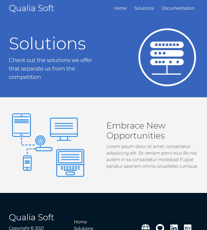
<section class="solutions-head bg-primary py-3">
<div class="container grid">
<div>
<h1 class="xl">Solutions</h1>
<p class="lead">
Check out the solutions we offer that separate us from the
competition
</p>
</div>
<img src="images/server.png" alt="" />
</div>
</section>
<!-- Footer -->
<footer class="footer bg-dark py-5">
<div class="container grid grid-3">
<div>
<h1>Qualia Soft</h1>
<p>
Copyright © 2021<br />
Made by
<a
target="_blank"
rel="noopener noreferrer"
href="https://radubulai.com"
>Radu-Alexandru Bulai</a
>
</p>
</div>
<nav>
<ul>
<li><a href="index.html">Home</a></li>
<li><a href="solutions.html">Solutions</a></li>
<li><a href="docs.html">Documentation</a></li>
</ul>
</nav>
<div class="social">
<a
target="_blank"
rel="noopener noreferrer"
href="https://radubulai.com"
><i class="fas fa-globe fa-2x"></i
></a>
<a
target="_blank"
rel="noopener noreferrer"
href="https://github.com/radualexandrub"
title="GitHub"
><i class="fab fa-github fa-2x"></i
></a>
<a
target="_blank"
rel="noopener noreferrer"
href="https://www.linkedin.com/in/radu-alexandru-bulai"
><i class="fab fa-linkedin fa-2x"></i
></a>
<a
target="_blank"
rel="noopener noreferrer"
href="https://dev.to/radualexandrub"
title="Dev.to"
><i class="fab fa-dev fa-2x"></i
></a>
</div>
</div>
</footer>
</body>
</html>
Note that we will continuingly use the CSS classes created in utilities.css in other pages too!
Now, for the little CSS part (we’ll create that .solutions-head class)
/******************/
/* solutions.html */
/******************/

/* Solutions Head / Hero section */
.solutions-head img {
  width: 200px;
  justify-self: flex-end;
}
We used justify-self: flex-end; to push the image item (within the flexbox container) to the end.
Solutions Sub-Head Sub-Hero section
<!-- SubHead / SubHero -->
<section class="solutions-sub-head bg-light py-3">
  <div class="container grid">
    <img src="images/server2.png" alt="" />
    <div>
      <h2 class="md">Embrace New Opportunities</h2>
      <p>
        Lorem ipsum dolor sit amet, consectetur adipisicing elit. Sit veniam
        porro eius illo nisi autem in ea consectetur molestias! Fugiat pariatur
        aperiam omnis voluptates cumque.
      </p>
    </div>
  </div>
</section>
And a little CSS:
.solutions-sub-head img {
  width: 300px;
}
Solutions-Main section
Monday, January 11, 2021, 14:10
<!-- Solutions-Main -->
<section class="solutions-main my-2">
  <div class="container grid grid-3">
    <div class="card flex">
      <i class="fas fa-server fa-3x"></i>
      <p>
        Lorem, ipsum dolor sit amet consectetur adipisicing elit. Nobis, ex?
      </p>
    </div>
    <div class="card flex">
      <i class="fas fa-network-wired fa-3x"></i>
      <p>
        Lorem, ipsum dolor sit amet consectetur adipisicing elit. Nobis, ex?
      </p>
    </div>
    <div class="card flex">
      <i class="fas fa-laptop-code fa-3x"></i>
      <p>
        Lorem, ipsum dolor sit amet consectetur adipisicing elit. Nobis, ex?
      </p>
    </div>
    <div class="card flex">
      <i class="fas fa-database fa-3x"></i>
      <p>
        Lorem, ipsum dolor sit amet consectetur adipisicing elit. Nobis, ex?
      </p>
    </div>
    <div class="card flex">
      <i class="fas fa-power-off fa-3x"></i>
      <p>
        Lorem, ipsum dolor sit amet consectetur adipisicing elit. Nobis, ex?
      </p>
    </div>
    <div class="card flex">
      <i class="fas fa-upload fa-3x"></i>
      <p>
        Lorem, ipsum dolor sit amet consectetur adipisicing elit. Nobis, ex?
      </p>
    </div>
  </div>
</section>
Now, for the CSS part, we want some items to span over the 3 column grid:
- the first item will span over 3 columns, occupying the whole first row
- the second item will span over 2 columns, occupying 2/3 of the second row
- and the next items will just follow in line
/* Solutions-Main section */
.solutions-main .grid {
  padding: 30px;
  gap: 20px;
}

.solutions-main .card > i {
  margin-right: 20px;
}

.solutions-main .grid > *:first-child {
  grid-column: 1 / span 3;
}

.solutions-main .grid > *:nth-child(2) {
  grid-column: 1 / span 2;
}
Documentation html page
Entire docs.html
<!DOCTYPE html>
<html lang="en">
<head>
<meta charset="UTF-8" />
<meta name="viewport" content="width=device-width, initial-scale=1.0" />
<link rel="stylesheet" href="css/utilities.css" />
<link rel="stylesheet" href="css/style.css" />
<link
rel="stylesheet"
href="https://cdnjs.cloudflare.com/ajax/libs/font-awesome/5.15.1/css/all.min.css"
/>
<title>Qualia Soft | Software Solutions for Everyone</title>
</head>
<body>
<!-- Navbar: Logo and Navigation -->
<div class="navbar">
<div class="container flex">
<h1 class="logo">Qualia Soft</h1>
<nav>
<ul>
<li><a href="index.html">Home</a></li>
<li><a href="solutions.html">Solutions</a></li>
<li><a href="docs.html">Docs</a></li>
</ul>
</nav>
</div>
</div>
<!-- Head / Hero -->
<section class="docs-head bg-primary py-3">
<div class="container grid">
<div>
<h1 class="xl">Documentation</h1>
<p class="lead">
Learn how to use our analytics software to see your App perfoms in
the real world
</p>
</div>
<img src="images/docs.png" alt="" />
</div>
</section>
<section class="docs-main my-4">
<div class="container grid">
<!-- First Grid Item, Sidebar -->
<div class="card bg-light p-3">
<h3 class="my-2">Essentials</h3>
<nav>
<ul>
<li><a href="#" class="text-primary">Introduction</a></li>
<li><a href="#">Login Information</a></li>
<li><a href="#">Get Started</a></li>
</ul>
</nav>
<h3 class="my-2">Navigation</h3>
<nav>
<ul>
<li><a href="#">Types of Metrics</a></li>
<li><a href="#">Clients Analytics</a></li>
<li><a href="#">App Ratings</a></li>
<li><a href="#">Preferences</a></li>
</ul>
</nav>
</div>
<!-- Second Grid Item, Context -->
<div class="card">
<h2>Introduction</h2>
<p>
Lorem ipsum dolor sit, amet consectetur adipisicing elit. Soluta
tenetur error amet nesciunt ipsam esse ipsa at molestias, maxime
numquam, modi a voluptatibus dolore, debitis magnam unde sint
officiis facere?
</p>
<div class="alert alert-success">
<i class="fas fa-info">
Lorem ipsum, dolor sit amet consectetur adipisicing elit. Quo,
minima.
</i>
</div>
<h3>Using our Web Application</h3>
<p>
Lorem ipsum dolor, sit amet consectetur adipisicing elit. Explicabo
hic debitis iste velit error totam deserunt quos facere? Cumque,
veniam?
</p>
<a href="#" class="btn btn-primary">Go to our Web App</a>
<h3>Requirements</h3>
<ul>
<li>Confirmed Registration Email</li>
<li>Received Login Information</li>
<li>Affirmative Deployment Status</li>
</ul>
<h3>Using our Custom Software</h3>
<p>
Lorem ipsum dolor, sit amet consectetur adipisicing elit. Iusto
quibusdam dolorum quis recusandae? Nostrum, omnis?
</p>
<a href="#" class="btn btn-primary">Download Software</a>
<h3>Additional Commands</h3>
<p>Mac (Homebrew)</p>
<pre><code>$ brew install qualia-metrics</code></pre>
<p>Linux (apt)</p>
<pre><code>$ sudo apt install qualia-metrics</code></pre>
<p>Linux (yum)</p>
<pre><code>$ sudo yum install qualia-metrics</code></pre>
</div>
</div>
</section>
<!-- Footer -->
<footer class="footer bg-dark py-5">
<div class="container grid grid-3">
<div>
<h1>Qualia Soft</h1>
<p>
Copyright © 2021<br />
Made by
<a
target="_blank"
rel="noopener noreferrer"
href="https://radubulai.com"
>Radu-Alexandru Bulai</a
>
</p>
</div>
<nav>
<ul>
<li><a href="index.html">Home</a></li>
<li><a href="solutions.html">Solutions</a></li>
<li><a href="docs.html">Docs</a></li>
</ul>
</nav>
<div class="social">
<a
target="_blank"
rel="noopener noreferrer"
href="https://radubulai.com"
><i class="fas fa-globe fa-2x"></i
></a>
<a
target="_blank"
rel="noopener noreferrer"
href="https://github.com/radualexandrub"
title="GitHub"
><i class="fab fa-github fa-2x"></i
></a>
<a
target="_blank"
rel="noopener noreferrer"
href="https://www.linkedin.com/in/radu-alexandru-bulai"
><i class="fab fa-linkedin fa-2x"></i
></a>
<a
target="_blank"
rel="noopener noreferrer"
href="https://dev.to/radualexandrub"
title="Dev.to"
><i class="fab fa-dev fa-2x"></i
></a>
</div>
</div>
</footer>
</body>
</html>
First things first, for our Documentation page we’ll actually have a two columned grid, where first item will be the sidebar itself, then the second item will be the context where information will be displayed. We need to set up our grid to be grid-template-columns: 1fr 2fr;, so the context will occupy 2/3 of the whole grid space.
We also need to align the sidebar (docs navigation as first grid item) to the top, for this we’ll just use align-items: flex-start; which will align all items on the top (all items will start from the top).
/******************/
/* docs.html */
/******************/
.docs-head img {
  width: 230px;
  justify-self: flex-end;
}

.docs-main h3 {
  margin: 20px;
}

.docs-main .grid {
  grid-template-columns: 1fr 2fr;
  align-items: flex-start;
}
So far so good:
New utility classes
We’ll also add the new classes to our utilities.css, namely: .alert , alert-success and alert-danger as well as some text-color (for our navigation sidebar)
/* utilities.css */
/* Alerts */
.alert {
  background-color: var(--light-color);
  padding: 10px 20px;
  font-weight: bold;
  margin: 15px 0;
}

.alert i {
  /* icon */
  margin-right: 10px;
}

.alert-success {
  background-color: var(--success-color);
  color: #fff;
}

.alert-danger {
  background-color: var(--danger-color);
  color: #fff;
}

/* Text colors */
.text-primary {
  color: var(--primary-color);
}

.text-secondary {
  color: var(--secondary-color);
}

.text-dark {
  color: var(--dark-color);
}

.text-light {
  color: var(--light-color);
}
And also add these new colors in our root in main style.css
/* style.css */
:root {
  --font-color: #222;
  --primary-color: #3764bd;
  --secondary-color: #325aac;
  --dark-color: #011627;
  --light-color: #f4f4f4;
  --success-color: #5cb85c;
  --danger-color: #dc3545;
}
CSS for docs page
We can also make a highlight for the currently selected item in our nav / sidebar: we’ll add in our docs.html, a class text-primary
Now we will style our links in our navigation sidebar, and our <code> style.
/* style.css */
/* Overwrite HTML Defaults */
code,
pre {
  background-color: #333;
  color: #fff;
  padding: 10px;
}

/******************/
/* docs.html */
/******************/
.docs-head img {
  width: 230px;
  justify-self: flex-end;
}

.docs-main h3 {
  margin: 20px;
}

.docs-main .grid {
  grid-template-columns: 1fr 2fr;
  align-items: flex-start;
}

.docs-main nav li {
  padding-top: 5px;
  padding-bottom: 3px;
  margin-bottom: 4px;
  border-bottom: 1px #ccc solid;
}

.docs-main nav a:hover {
  font-weight: bold;
}
Media Queries for Solutions and Docs page
Monday, January 11, 2021, 16:18
We’ll just add the new classes (from each new page created: solutions.html and docs.html) to our current media queries (that we created earlier). We can also place them at the bottom of our style.css file.
Note that we actually did a OK job with our naming conventions:
- navbar section
index.html- section with class
.showcase - section with class
.stats - section with class
.steps - section with class
.banner - section with class
.technologies
- section with class
solutions.html.solutions-head.solutions-sub-head.solutions-main
docs.html.docs-head.docs-main
- footer section
Okay, so first we add all those classes to the properties of grid-template-columns: 1fr; and grid-template-rows: 1fr;.
Then, we align the texts to the center using:
.solutions-head,
.solutions-sub-head,
.docs-head {
  text-align: center;
}
Note that our images will not center yet by using this… so in order to align our images, we need to create separate classes, like this:
.solutions-head img,
.solutions-sub-head img,
.docs-head img {
  justify-self: center;
}
Now, just like the last time, we need to solve this thing in our solutions.html:
So, we’ll reset again the properties of grid that we set earlier (note that we only modified columns, not both column and row), so we can simply write:
.solutions-main .grid > *:first-child,
.solutions-main .grid > *:nth-child(2) {
  grid-column: 1;
}
And Done.
(Note, you can take long screenshot within Desktop Browser using FireShot Chrome Extension)
Here’s the code for all the @media queries of those 3 pages (index.html, solutions.html, docs.html):
/****************************/
/* Media Queries for Mobile */
/****************************/

/* Tablets and under */
@media (max-width: 768px) {
  .grid,
  .showcase .grid,
  .stats .grid,
  .steps .grid,
  .banner .grid,
  .solutions-head .grid,
  .solutions-sub-head .grid,
  .solutions-main .grid,
  .docs-head .grid,
  .docs-main .grid {
    grid-template-columns: 1fr;
    grid-template-rows: 1fr;
  }

  .showcase {
    height: auto;
  }

  .showcase-text {
    text-align: center;
    margin-top: 40px;
  }

  .showcase-form {
    justify-self: center;
    margin: auto;
    max-width: 500px;
  }

  .steps .grid > *:first-child {
    grid-column: 1;
    grid-row: 1;
  }

  .steps .grid {
    padding-bottom: 30px;
  }

  .solutions-head,
  .solutions-sub-head,
  .docs-head {
    text-align: center;
  }

  .solutions-head img,
  .solutions-sub-head img,
  .docs-head img {
    justify-self: center;
  }

  .solutions-main .grid > *:first-child,
  .solutions-main .grid > *:nth-child(2) {
    grid-column: 1;
  }
}

/* Mobile */
@media (max-width: 550px) {
  .navbar {
    height: 90px;
  }

  .navbar .flex {
    flex-direction: column;
    overflow: visible;
    justify-content: center;
  }

  .navbar ul {
    padding: 10px;
    background-color: rgba(0, 0, 0, 0.1);
  }
}
Homepage Animation
First, we will make the following keyframes in our style.css (they are basically translating whichever element from the complete outreach/outside of the page, namely -100% and 100% to the actual visible page 0%, for Y axis and X axis):
@keyframes slideInFromLeft {
  0% {
    transform: translateX(-100%);
  }
  100% {
    transform: translate(0);
  }
}

@keyframes slideInFromRight {
  0% {
    transform: translateX(100%);
  }
  100% {
    transform: translate(0);
  }
}

@keyframes slideInFromTop {
  0% {
    transform: translateY(-100%);
  }
  100% {
    transform: translate(0);
  }
}

@keyframes slideInFromBottom {
  0% {
    transform: translateY(100%);
  }
  100% {
    transform: translate(0);
  }
}
Now we’ll integrate those keyframes into animations, in our showcase / hero section from index.html:
/* Intro Animations */
.showcase-text {
  animation: slideInFromLeft 500ms ease-out;
}

.showcase-form {
  animation: slideInFromRight 500ms ease-out;
}

/* Stats Section */
.stats {
  padding-top: 100px;
  animation: slideInFromBottom 500ms ease-out;
}

/* Steps CLI Section */
.steps {
  animation: slideInFromBottom 500ms ease-out;
}
Cute. That was actually a lot easier to make than I’ve expected.
You can also make different animations just for mobile screens by just overwriting them in the @media queries… For example:
/* Intro Animations for mobile screens */
@media (max-width: 768px) {
  .showcase-text {
    animation: slideInFromTop 500ms ease-out;
  }

  .showcase-form {
    animation: slideInFromBottom 500ms ease-out;
  }

  .stats {
    animation: slideInFromBottom 500ms ease-out;
  }

  .steps {
    animation: slideInFromBottom 500ms ease-out;
  }
}
Complete Code
Project File Tree:
ResponsiveWebsiteTutorial/
┣ css/
┃ ┣ style.css
┃ ┗ utilities.css
┣ images/
┃ ┣ logos/
┃ ┃ ┣ csharp.png
┃ ┃ ┣ django.png
┃ ┃ ┣ go.png
┃ ┃ ┣ node.png
┃ ┃ ┣ php.png
┃ ┃ ┣ python.png
┃ ┃ ┣ ruby.png
┃ ┃ ┗ scala.png
┃ ┣ cli.png
┃ ┣ cloud.png
┃ ┣ docs.png
┃ ┣ server.png
┃ ┗ server2.png
┣ docs.html
┣ index.html
┗ solutions.html
index.html
<!DOCTYPE html>
<html lang="en">
<head>
<meta charset="UTF-8" />
<meta name="viewport" content="width=device-width, initial-scale=1.0" />
<link rel="stylesheet" href="css/utilities.css" />
<link rel="stylesheet" href="css/style.css" />
<link
rel="stylesheet"
href="https://cdnjs.cloudflare.com/ajax/libs/font-awesome/5.15.1/css/all.min.css"
/>
<title>Qualia Soft | Software Solutions for Everyone</title>
</head>
<body>
<!-- Navbar: Logo and Navigation -->
<div class="navbar">
<div class="container flex">
<h1 class="logo">Qualia Soft</h1>
<nav>
<ul>
<li><a href="index.html">Home</a></li>
<li><a href="solutions.html">Solutions</a></li>
<li><a href="docs.html">Docs</a></li>
</ul>
</nav>
</div>
</div>
<!-- Showcase | Hero Section -->
<section class="showcase">
<div class="container grid">
<div class="showcase-text">
<h1>Bring Alive Ideas Seamlessly</h1>
<p>
We create applications of all kinds, from small static websites for
individuals to large scale enterprise software. Fill out the form
bellow to be in queue for a Live Demonstration of your own idea
</p>
<a href="solutions.html" class="btn btn-outline">Read More</a>
</div>
<div class="showcase-form card">
<h2>Request a Demo</h2>
<form>
<div class="form-control">
<input
type="text"
name="first_name"
placeholder="First Name"
required
/>
</div>
<div class="form-control">
<input
type="text"
name="last_name"
placeholder="Last Name"
required
/>
</div>
<div class="form-control">
<input
type="text"
name="company_name"
placeholder="Company Name (optional)"
/>
</div>
<div class="form-control">
<input type="email" name="email" placeholder="Email" required />
</div>
<input type="submit" value="Send" class="btn btn-primary" />
</form>
</div>
</div>
</section>
<!-- Stats -->
<section class="stats">
<div class="container">
<h3 class="stats-heading text-center my-1">
Achievements we've reached so far
</h3>
<div class="grid grid-3 text-center my-4">
<div>
<i class="fas fa-server fa-3x"></i>
<h3>174</h3>
<p class="text-secondary">Deployed Software<br />Applications</p>
</div>
<div>
<i class="far fa-building fa-3x"></i>
<h3>58</h3>
<p class="text-secondary">Registered Software<br />Companies</p>
</div>
<div>
<i class="far fa-smile-beam fa-3x"></i>
<h3>131</h3>
<p class="text-secondary">Happy Clients</p>
</div>
</div>
</div>
</section>
<!-- Steps -->
<section class="steps">
<div class="container grid">
<img src="images/cli.png" alt="" />
<div class="card">
<h3>Pick the right app that suits your idea</h3>
</div>
<div class="card">
<h3>Get weekly updates on your app development</h3>
</div>
<div class="card">
<h3>Deploy and see live metrics about your app</h3>
</div>
</div>
</section>
<!-- Banner -->
<section class="banner bg-primary my-2 py-2">
<div class="container grid">
<div class="text-center">
<h2 class="lg">Discover Our Digital Capabilities</h2>
<p class="lead my-1">
With an acumulated experience from a talented team of developers, we
deliver beautiful apps right on time
</p>
<a href="solutions.html" class="btn btn-dark">Read More</a>
</div>
<img src="images/cloud.png" alt="" />
</div>
</section>
<!-- Technologies -->
<section class="technologies">
<h2 class="md text-center my">Tech Stack we use</h2>
<div class="container flex">
<div class="card">
<h4>Django</h4>
<img src="images/logos/django.png" alt="" />
</div>
<div class="card">
<h4>Node.js</h4>
<img src="images/logos/node.png" alt="" />
</div>
<div class="card">
<h4>Go</h4>
<img src="images/logos/go.png" alt="" />
</div>
<div class="card">
<h4>Ruby</h4>
<img src="images/logos/ruby.png" alt="" />
</div>
<div class="card">
<h4>C#</h4>
<img src="images/logos/csharp.png" alt="" />
</div>
<div class="card">
<h4>PHP</h4>
<img src="images/logos/php.png" alt="" />
</div>
<div class="card">
<h4>Python</h4>
<img src="images/logos/python.png" alt="" />
</div>
</div>
</section>
<!-- Footer -->
<footer class="footer bg-dark py-5">
<div class="container grid grid-3">
<div>
<h1>Qualia Soft</h1>
<p>
Copyright © 2021<br />
Made by
<a
target="_blank"
rel="noopener noreferrer"
href="https://radubulai.com"
>Radu-Alexandru Bulai</a
>
</p>
</div>
<nav>
<ul>
<li><a href="index.html">Home</a></li>
<li><a href="solutions.html">Solutions</a></li>
<li><a href="docs.html">Docs</a></li>
</ul>
</nav>
<div class="social">
<a
target="_blank"
rel="noopener noreferrer"
href="https://radubulai.com"
><i class="fas fa-globe fa-2x"></i
></a>
<a
target="_blank"
rel="noopener noreferrer"
href="https://github.com/radualexandrub"
title="GitHub"
><i class="fab fa-github fa-2x"></i
></a>
<a
target="_blank"
rel="noopener noreferrer"
href="https://www.linkedin.com/in/radu-alexandru-bulai"
><i class="fab fa-linkedin fa-2x"></i
></a>
<a
target="_blank"
rel="noopener noreferrer"
href="https://dev.to/radualexandrub"
title="Dev.to"
><i class="fab fa-dev fa-2x"></i
></a>
</div>
</div>
</footer>
</body>
</html>
solutions.html
<!DOCTYPE html>
<html lang="en">
<head>
<meta charset="UTF-8" />
<meta name="viewport" content="width=device-width, initial-scale=1.0" />
<link rel="stylesheet" href="css/utilities.css" />
<link rel="stylesheet" href="css/style.css" />
<link
rel="stylesheet"
href="https://cdnjs.cloudflare.com/ajax/libs/font-awesome/5.15.1/css/all.min.css"
/>
<title>Qualia Soft | Software Solutions for Everyone</title>
</head>
<body>
<!-- Navbar: Logo and Navigation -->
<div class="navbar">
<div class="container flex">
<h1 class="logo">Qualia Soft</h1>
<nav>
<ul>
<li><a href="index.html">Home</a></li>
<li><a href="solutions.html">Solutions</a></li>
<li><a href="docs.html">Docs</a></li>
</ul>
</nav>
</div>
</div>
<!-- Head / Hero -->
<section class="solutions-head bg-primary py-3">
<div class="container grid">
<div>
<h1 class="xl">Solutions</h1>
<p class="lead">
Check out the solutions we offer that separate us from the
competition
</p>
</div>
<img src="images/server.png" alt="" />
</div>
</section>
<!-- SubHead / SubHero -->
<section class="solutions-sub-head bg-light py-3">
<div class="container grid">
<img src="images/server2.png" alt="" />
<div>
<h2 class="md">Embrace New Opportunities</h2>
<p>
Lorem ipsum dolor sit amet, consectetur adipisicing elit. Sit veniam
porro eius illo nisi autem in ea consectetur molestias! Fugiat
pariatur aperiam omnis voluptates cumque.
</p>
</div>
</div>
</section>
<!-- Solutions-Main -->
<section class="solutions-main my-2">
<div class="container grid grid-3">
<div class="card flex">
<i class="fas fa-server fa-3x"></i>
<p>
Lorem, ipsum dolor sit amet consectetur adipisicing elit. Nobis, ex?
</p>
</div>
<div class="card flex">
<i class="fas fa-network-wired fa-3x"></i>
<p>
Lorem, ipsum dolor sit amet consectetur adipisicing elit. Nobis, ex?
</p>
</div>
<div class="card flex">
<i class="fas fa-laptop-code fa-3x"></i>
<p>
Lorem, ipsum dolor sit amet consectetur adipisicing elit. Nobis, ex?
</p>
</div>
<div class="card flex">
<i class="fas fa-database fa-3x"></i>
<p>
Lorem, ipsum dolor sit amet consectetur adipisicing elit. Nobis, ex?
</p>
</div>
<div class="card flex">
<i class="fas fa-power-off fa-3x"></i>
<p>
Lorem, ipsum dolor sit amet consectetur adipisicing elit. Nobis, ex?
</p>
</div>
<div class="card flex">
<i class="fas fa-upload fa-3x"></i>
<p>
Lorem, ipsum dolor sit amet consectetur adipisicing elit. Nobis, ex?
</p>
</div>
</div>
</section>
<!-- Footer -->
<footer class="footer bg-dark py-5">
<div class="container grid grid-3">
<div>
<h1>Qualia Soft</h1>
<p>
Copyright © 2021<br />
Made by
<a
target="_blank"
rel="noopener noreferrer"
href="https://radubulai.com"
>Radu-Alexandru Bulai</a
>
</p>
</div>
<nav>
<ul>
<li><a href="index.html">Home</a></li>
<li><a href="solutions.html">Solutions</a></li>
<li><a href="docs.html">Docs</a></li>
</ul>
</nav>
<div class="social">
<a
target="_blank"
rel="noopener noreferrer"
href="https://radubulai.com"
><i class="fas fa-globe fa-2x"></i
></a>
<a
target="_blank"
rel="noopener noreferrer"
href="https://github.com/radualexandrub"
title="GitHub"
><i class="fab fa-github fa-2x"></i
></a>
<a
target="_blank"
rel="noopener noreferrer"
href="https://www.linkedin.com/in/radu-alexandru-bulai"
><i class="fab fa-linkedin fa-2x"></i
></a>
<a
target="_blank"
rel="noopener noreferrer"
href="https://dev.to/radualexandrub"
title="Dev.to"
><i class="fab fa-dev fa-2x"></i
></a>
</div>
</div>
</footer>
</body>
</html>
docs.html
<!DOCTYPE html>
<html lang="en">
<head>
<meta charset="UTF-8" />
<meta name="viewport" content="width=device-width, initial-scale=1.0" />
<link rel="stylesheet" href="css/utilities.css" />
<link rel="stylesheet" href="css/style.css" />
<link
rel="stylesheet"
href="https://cdnjs.cloudflare.com/ajax/libs/font-awesome/5.15.1/css/all.min.css"
/>
<title>Qualia Soft | Software Solutions for Everyone</title>
</head>
<body>
<!-- Navbar: Logo and Navigation -->
<div class="navbar">
<div class="container flex">
<h1 class="logo">Qualia Soft</h1>
<nav>
<ul>
<li><a href="index.html">Home</a></li>
<li><a href="solutions.html">Solutions</a></li>
<li><a href="docs.html">Docs</a></li>
</ul>
</nav>
</div>
</div>
<!-- Head / Hero -->
<section class="docs-head bg-primary py-3">
<div class="container grid">
<div>
<h1 class="xl">Documentation</h1>
<p class="lead">
Learn how to use our analytics software to see your App perfoms in
the real world
</p>
</div>
<img src="images/docs.png" alt="" />
</div>
</section>
<section class="docs-main my-4">
<div class="container grid">
<!-- First Grid Item, Sidebar -->
<div class="card bg-light p-3">
<h3 class="my-2">Essentials</h3>
<nav>
<ul>
<li>
<a href="#" class="text-primary text-bold">Introduction</a>
</li>
<li><a href="#">Login Information</a></li>
<li><a href="#">Get Started</a></li>
</ul>
</nav>
<h3 class="my-2">Navigation</h3>
<nav>
<ul>
<li><a href="#">Types of Metrics</a></li>
<li><a href="#">Clients Analytics</a></li>
<li><a href="#">App Ratings</a></li>
<li><a href="#">Preferences</a></li>
</ul>
</nav>
</div>
<!-- Second Grid Item, Context -->
<div class="card">
<h2>Introduction</h2>
<p>
Lorem ipsum dolor sit, amet consectetur adipisicing elit. Soluta
tenetur error amet nesciunt ipsam esse ipsa at molestias, maxime
numquam, modi a voluptatibus dolore, debitis magnam unde sint
officiis facere?
</p>
<div class="alert alert-success">
<i class="fas fa-info">
Lorem ipsum, dolor sit amet consectetur adipisicing elit. Quo,
minima.
</i>
</div>
<h3>Using our Web Application</h3>
<p>
Lorem ipsum dolor, sit amet consectetur adipisicing elit. Explicabo
hic debitis iste velit error totam deserunt quos facere? Cumque,
veniam?
</p>
<a href="#" class="btn btn-primary">Go to our Web App</a>
<h3>Requirements</h3>
<ul>
<li>Confirmed Registration Email</li>
<li>Received Login Information</li>
<li>Affirmative Deployment Status</li>
</ul>
<h3>Using our Custom Software</h3>
<p>
Lorem ipsum dolor, sit amet consectetur adipisicing elit. Iusto
quibusdam dolorum quis recusandae? Nostrum, omnis?
</p>
<a href="#" class="btn btn-primary">Download Software</a>
<h3>Additional Commands</h3>
<p>Mac (Homebrew)</p>
<pre><code>$ brew install qualia-metrics</code></pre>
<p>Linux (apt)</p>
<pre><code>$ sudo apt install qualia-metrics</code></pre>
<p>Linux (yum)</p>
<pre><code>$ sudo yum install qualia-metrics</code></pre>
</div>
</div>
</section>
<!-- Footer -->
<footer class="footer bg-dark py-5">
<div class="container grid grid-3">
<div>
<h1>Qualia Soft</h1>
<p>
Copyright © 2021<br />
Made by
<a
target="_blank"
rel="noopener noreferrer"
href="https://radubulai.com"
>Radu-Alexandru Bulai</a
>
</p>
</div>
<nav>
<ul>
<li><a href="index.html">Home</a></li>
<li><a href="solutions.html">Solutions</a></li>
<li><a href="docs.html">Docs</a></li>
</ul>
</nav>
<div class="social">
<a
target="_blank"
rel="noopener noreferrer"
href="https://radubulai.com"
><i class="fas fa-globe fa-2x"></i
></a>
<a
target="_blank"
rel="noopener noreferrer"
href="https://github.com/radualexandrub"
title="GitHub"
><i class="fab fa-github fa-2x"></i
></a>
<a
target="_blank"
rel="noopener noreferrer"
href="https://www.linkedin.com/in/radu-alexandru-bulai"
><i class="fab fa-linkedin fa-2x"></i
></a>
<a
target="_blank"
rel="noopener noreferrer"
href="https://dev.to/radualexandrub"
title="Dev.to"
><i class="fab fa-dev fa-2x"></i
></a>
</div>
</div>
</footer>
</body>
</html>
utilities.css
/* Utilities: Classes for reuse */
.container {
  max-width: 1200px;
  margin: 0 auto;
  overflow: auto;
  padding: 0 40px;
}

.flex {
  display: flex;
  justify-content: center;
  align-items: center;
  height: 100%;
}

.grid {
  display: grid;
  grid-template-columns: 1fr 1fr;
  gap: 20px;
  justify-content: center;
  align-items: center;
  height: 100%;
}

.grid-3 {
  grid-template-columns: repeat(3, 1fr);
}

.card {
  background-color: #fff;
  color: var(--font-color);
  border-radius: 30px;
  box-shadow: 0 3px 10px rgba(0, 0, 0, 0.2);
  padding: 20px;
  margin: 10px;
}

.btn {
  display: inline-block;
  padding: 10px 30px;
  cursor: pointer;
  background-color: var(--primary-color);
  color: #fff;
  border: none;
  border-radius: 5px;
  transition: transform 100ms, opacity 100ms;
}

.btn-outline {
  background-color: transparent;
  border: 1px #fff solid;
}

.btn:hover {
  transform: scale(0.97);
  opacity: 0.95;
}

/* Backgrounds & colored buttons */
.bg-primary,
.btn-primary {
  background-color: var(--primary-color);
  color: #fff;
}

.btn-secondary,
.bg-secondary {
  background-color: var(--secondary-color);
  color: #fff;
}

.bg-dark,
.btn-dark {
  background-color: var(--dark-color);
  color: #fff;
}

.btn-light,
.bg-light {
  background-color: var(--light-color);
  color: var(--font-color);
}

.bg-primary a,
.btn-primary a,
.btn-secondary a,
.bg-secondary a,
.bg-dark a,
.btn-dark a {
  color: #fff;
}

/* Text colors */
.text-bold {
  font-weight: bold;
}

.text-primary {
  color: var(--primary-color);
}

.text-secondary {
  color: var(--secondary-color);
}

.text-dark {
  color: var(--dark-color);
}

.text-light {
  color: var(--light-color);
}

/* Alerts */
.alert {
  background-color: var(--light-color);
  padding: 10px 20px;
  font-weight: bold;
  margin: 15px 0;
}

.alert i {
  /* icon */
  margin-right: 10px;
}

.alert-success {
  background-color: var(--success-color);
  color: #fff;
}

.alert-danger {
  background-color: var(--danger-color);
  color: #fff;
}

/* Text sizes */
.lead {
  font-size: 20px;
}

.sm {
  font-size: 1rem;
}

.md {
  font-size: 2rem;
}

.lg {
  font-size: 3rem;
}

.xl {
  font-size: 4rem;
}

.text-center {
  text-align: center;
}

/* Utilities: Margins */
/* Margins for top and bottom */
.my-1 {
  margin: 1rem 0;
}
.my-2 {
  margin: 1.5rem 0;
}
.my-3 {
  margin: 2rem 0;
}
.my-4 {
  margin: 3rem 0;
}
.my-5 {
  margin: 4rem 0;
}

/* Margins for all around */
.m-1 {
  margin: 1rem;
}
.m-2 {
  margin: 1.5rem;
}
.m-3 {
  margin: 2rem;
}
.m-4 {
  margin: 3rem;
}
.m-5 {
  margin: 4rem;
}

/* Paddings for top and bottom */
.py-1 {
  padding: 1rem 0;
}
.py-2 {
  padding: 1.5rem 0;
}
.py-3 {
  padding: 2rem 0;
}
.py-4 {
  padding: 3rem 0;
}
.py-5 {
  padding: 4rem 0;
}

/* Paddings for all around */
.p-1 {
  padding: 1rem;
}
.p-2 {
  padding: 1.5rem;
}
.p-3 {
  padding: 2rem;
}
.p-4 {
  padding: 3rem;
}
.p-5 {
  padding: 4rem;
}
style.css
@import url("https://fonts.googleapis.com/css2?family=Montserrat:wght@300&display=swap");

:root {
  --font-color: #222;
  --primary-color: #3764bd;
  --secondary-color: #325aac;
  --dark-color: #011627;
  --light-color: #f4f4f4;
  --success-color: #5cb85c;
  --danger-color: #dc3545;
}

/* Overwrite HTML Defaults */
* {
  box-sizing: border-box;
  padding: 0;
  margin: 0;
}

::selection {
  color: #fff;
  background: var(--primary-color);
}

body {
  font-family: "Montserrat", sans-serif;
  color: var(--font-color);
  line-height: 1.6;
}

ul {
  list-style-type: none;
}

a {
  text-decoration: none;
  color: var(--font-color);
}

h1,
h2 {
  font-weight: 300;
  line-height: 1.2;
  margin: 10px 0;
}

p {
  margin: 10px 0;
}

img {
  width: 100%;
}

code,
pre {
  background-color: #333;
  color: #fff;
  padding: 10px;
}

.hidden {
  visibility: hidden;
  height: 0;
}

/* Navbar */
.navbar {
  background-color: var(--primary-color);
  color: #fff;
  height: 70px;
}

.navbar .flex {
  justify-content: space-between;
  overflow: visible;
}

.navbar ul {
  display: flex;
}

.navbar a {
  color: #fff;
  padding: 10px;
  margin: 0 5px;
}

.navbar a:hover {
  border-bottom: 2px #fff solid;
}

/******************/
/*** index.html ***/
/******************/

/* Showcase | Hero Section */
.showcase {
  position: relative;
  height: 400px;
  background: linear-gradient(
    180deg,
    var(--primary-color),
    var(--secondary-color)
  );
  color: #fff;
}

.showcase h1 {
  font-size: 40px;
}

.showcase p {
  margin: 20px 0;
}

.showcase .grid {
  grid-template-columns: 60% 40%;
  gap: 30px;
  overflow: visible;
}

.showcase-form {
  position: relative;
  top: 60px;
  height: auto;
  width: 100%;
  padding: 20px 40px;
  z-index: 100;
  justify-self: flex-end;
}

.showcase-form .form-control {
  margin: 30px 0;
}

.showcase-form input[type="text"],
.showcase-form input[type="email"] {
  border: 0;
  border-bottom: 1px solid #b4becb;
  width: 100%;
  padding: 3px;
  font-size: 16px;
}

.showcase-form input:focus {
  outline: none;
}

.showcase::before,
.showcase::after {
  content: "";
  position: absolute;
  height: 100px;
  bottom: -70px;
  right: 0;
  left: 0;
  background: #fff;
  transform: skewY(-2deg);
  -webkit-transform: skewY(-2deg);
  -moz-transform: skewY(-2deg);
  -ms-transform: skewY(-2deg);
}

/* Intro Animations */
.showcase-text {
  animation: slideInFromLeft 500ms ease-out;
}

.showcase-form {
  animation: slideInFromRight 500ms ease-out;
}

/* Stats Section */
.stats {
  padding-top: 100px;
  animation: slideInFromBottom 500ms ease-out;
}

.stats-heading {
  max-width: 500px;
  margin: auto;
}

.stats .grid h3 {
  font-size: 35px;
}

.stats .grid p {
  font-size: 20px;
  font-weight: bold;
}

/* Steps CLI Section */
.steps {
  animation: slideInFromBottom 500ms ease-out;
}

.steps .grid {
  grid-template-columns: repeat(3, 1fr);
  grid-template-rows: repeat(3, 1fr);
}

.steps .grid > *:first-child {
  grid-column: 1 / span 2;
  grid-row: 1 / span 3;
}

/* Banner Section */
.banner .grid {
  grid-template-columns: 4fr 3fr;
}

.banner {
  position: relative;
  margin-top: 40px;
}

.banner::before,
.banner::after {
  content: "";
  position: absolute;
  height: 65px;
  top: -45px;
  right: 0;
  left: 0;
  background: #fff;
  transform: skewY(1deg);
  -webkit-transform: skewY(1deg);
  -moz-transform: skewY(1deg);
  -ms-transform: skewY(1deg);
}

/* Technologies Section */
.technologies .flex {
  flex-wrap: wrap;
}

.technologies .card {
  text-align: center;
  margin: 18px 10px 40px;
}

.technologies .card .h4 {
  font-size: 20px;
  margin-bottom: 10px;
}

.technologies .card:hover {
  animation-name: bounce;
  animation-duration: 250ms;
  animation-iteration-count: infinite;
  animation-direction: alternate;
  animation-timing-function: ease-out;
}

@keyframes bounce {
  0% {
    transform: translateY(0px);
  }
  100% {
    transform: translateY(-15px);
  }
}

/* Footer */
.footer .social a {
  margin: 0 10px;
}

.footer a:hover {
  color: #ddd;
}

.footer .social i {
  transition: transform 100ms;
}

.footer .social i:hover {
  transform: scale(1.1);
}

/******************/
/* solutions.html */
/******************/

/* Solutions Head / Hero section */
.solutions-head img {
  width: 240px;
  justify-self: flex-end;
}

.solutions-sub-head img {
  width: 300px;
}

/* Solutions-Main section */
.solutions-main .grid {
  padding: 30px;
  gap: 20px;
}

.solutions-main .card > i {
  margin-right: 20px;
}

.solutions-main .grid > *:first-child {
  grid-column: 1 / span 3;
}

.solutions-main .grid > *:nth-child(2) {
  grid-column: 1 / span 2;
}

/*************/
/* docs.html */
/*************/

.docs-head img {
  width: 230px;
  justify-self: flex-end;
}

.docs-main h3 {
  margin: 20px;
}

.docs-main .grid {
  grid-template-columns: 1fr 2fr;
  align-items: flex-start;
}

.docs-main nav li {
  padding-top: 5px;
  padding-bottom: 3px;
  margin-bottom: 4px;
  border-bottom: 1px #ccc solid;
}

.docs-main nav a:hover {
  font-weight: bold;
}

/**************/
/* Animations */
/**************/

@keyframes slideInFromLeft {
  0% {
    transform: translateX(-100%);
  }
  100% {
    transform: translate(0);
  }
}

@keyframes slideInFromRight {
  0% {
    transform: translateX(100%);
  }
  100% {
    transform: translate(0);
  }
}

@keyframes slideInFromTop {
  0% {
    transform: translateY(-100%);
  }
  100% {
    transform: translate(0);
  }
}

@keyframes slideInFromBottom {
  0% {
    transform: translateY(100%);
  }
  100% {
    transform: translate(0);
  }
}

/****************************/
/* Media Queries for Mobile */
/****************************/

/* Tablets and under */
@media (max-width: 768px) {
  .grid,
  .showcase .grid,
  .stats .grid,
  .steps .grid,
  .banner .grid,
  .solutions-head .grid,
  .solutions-sub-head .grid,
  .solutions-main .grid,
  .docs-head .grid,
  .docs-main .grid {
    grid-template-columns: 1fr;
    grid-template-rows: 1fr;
  }

  .showcase {
    height: auto;
  }

  .showcase-text {
    text-align: center;
    margin-top: 40px;
  }

  .showcase-form {
    justify-self: center;
    margin: auto;
    max-width: 500px;
  }

  .steps .grid > *:first-child {
    grid-column: 1;
    grid-row: 1;
  }

  .steps .grid {
    padding-bottom: 30px;
  }

  .solutions-head,
  .solutions-sub-head,
  .docs-head {
    text-align: center;
  }

  .solutions-head img,
  .solutions-sub-head img,
  .docs-head img {
    justify-self: center;
  }

  .solutions-main .grid > *:first-child,
  .solutions-main .grid > *:nth-child(2) {
    grid-column: 1;
  }
}

/* Mobile */
@media (max-width: 550px) {
  .navbar {
    height: 90px;
  }

  .navbar .flex {
    flex-direction: column;
    overflow: visible;
    justify-content: center;
  }

  .navbar ul {
    padding: 10px;
    background-color: rgba(0, 0, 0, 0.1);
  }
}

/* Intro Animations for mobile screens */
@media (max-width: 768px) {
  .showcase-text {
    animation: slideInFromTop 500ms ease-out;
  }

  .showcase-form {
    animation: slideInFromBottom 500ms ease-out;
  }
}