Study
Responsive Web Design Certification - freeCodeCamp
Credits / Notes taken from:
- Responsive Web Design Certification - freeCodeCamp
- HTML Tutorial from w3schools.com
- CSS Tutorial from w3schools.com
Contents
- Responsive Web Design Certification - freeCodeCamp
- Credits / Notes taken from:
- Contents
- Basic HTML and HTML5
- Basic CSS
- Use a CSS Class to Style an Element
- Import a Google Font
- Size images and add border
- Give a Background Color to a div Element
- Use an id Attribute to Style an Element
- Priorities and Orders in CSS - Overriding styles
- Use Attribute Selectors to Style Elements
- Adjust padding and margin of an element
- Absolute Units versus Relative Units
- CSS Variables
- Colors in CSS
- Applied Visual Design
- Text Alignment and Formatting in CSS
- Box shadow and opacity of Elements
- Text transform (uppercase, lowercase) and font size
- Relative Position, offsets, Absolute Position, Fixed Position
- Center an Element Horizontally Using the margin Property
- Gradual CSS Linear Gradient
- CSS Transform Property: scale, move, rotate and skew
- More Complex Shape Using CSS, ::before and ::after pseudo-elements
- CSS Animations, @keyframes and Animation Properties
- CSS Transitions
- Applied Accessibility
- Responsive Web Design Principles
- CSS Flexbox
- CSS Grid
- Responsive Web Design Projects
Basic HTML and HTML5
Comments in HTML start with <!-- and end with a -->
HTML5 (released on 28 October 2014) introduces more descriptive HTML tags. These include main, header, footer, nav, video, article, section and others.
These tags give a descriptive structure to your HTML, make your HTML easier to read, and help with Search Engine Optimization (SEO) and accessibility. The main HTML5 tag helps search engines and other developers find the main content of your page.
<h2>CatPhotoApp</h2>
<main>
  <p>
    Kitty ipsum dolor sit amet, shed everywhere shed everywhere stretching
    attack your ankles chase the red dot, hairball run catnip eat the grass
    sniff.
  </p>
  <p>
    Purr jump eat the grass rip the couch scratched sunbathe, shed everywhere
    rip the couch sleep in the sink fluffy fur catnip scratched.
  </p>
  <a href="#"
    ><img
      src="https://bit.ly/fcc-relaxing-cat"
      alt="A business cat wearing a necktie."
  /></a>
  <p>
    View more
    <a target="_blank" href="https://freecatphotoapp.com">cat photos</a>
  </p>
  <!-- the value "_blank" specifies to open the link in a new tab -->
</main>
<section>
  <h1>WWF</h1>
  <p>
    The World Wide Fund for Nature (WWF) is an international organization
    working on issues regarding the conservation, research and restoration of
    the environment, formerly named the World Wildlife Fund. WWF was founded in
    1961.
  </p>
</section>
Declare the Doctype of an HTML Document
At the top of your document, you need to tell the browser which version of HTML your page is using. HTML is an evolving language, and is updated regularly. Most major browsers support the latest specification, which is HTML5. However, older web pages may use previous versions of the language.
You tell the browser this information by adding the <!DOCTYPE ...> tag on the first line, where the ... part is the version of HTML. For HTML5, you use <!DOCTYPE html>.
The ! and uppercase DOCTYPE is important, especially for older browsers. The html is not case sensitive.
Next, the rest of your HTML code needs to be wrapped in html tags. The opening <html> goes directly below the <!DOCTYPE html> line, and the closing </html> goes at the end of the page.
<!DOCTYPE html>
<html>
  <head>
    <title>Page title</title>
    <!-- metadata elements -->
  </head>
  <body>
    <!-- page contents -->
  </body>
</html>
Link to Internal Sections of a Page with Anchor Elements
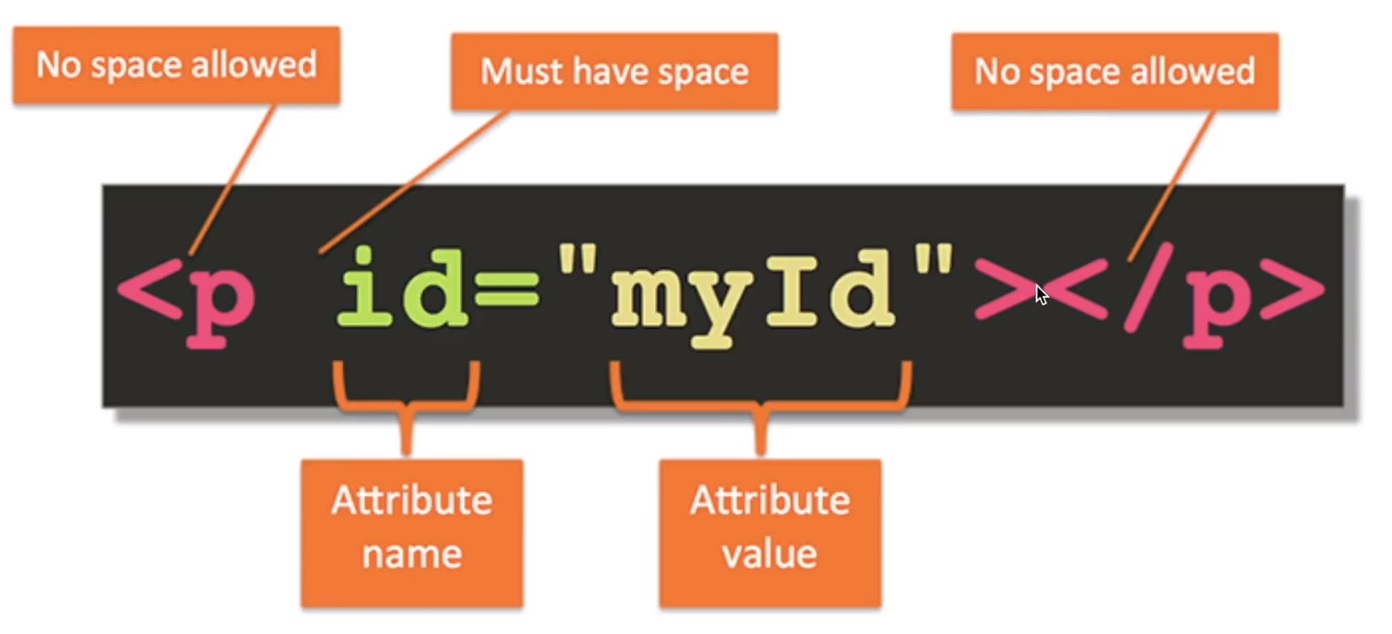
To create an internal link, you assign a link’s href attribute to a hash symbol # plus the value of the id attribute for the element that you want to internally link to, usually further down the page. You then need to add the same id attribute to the element you are linking to. An id is an attribute that uniquely describes an element.
<a href="#contacts-header">Contacts</a>
<a href="#footer">Jump to Bottom</a>

<h2 id="contacts-header">Contacts</h2>
<footer id="footer">Copyright Cat Photo App</footer>
Lists
Unordered ul and ordered ol lists
<h2>CatPhotoApp</h2>
<main>
  <p>Click here to view more <a href="#">cat photos</a>.</p>
  <p>Things cats love:</p>
  <ul>
    <li>cat nip</li>
    <li>laser pointers</li>
    <li>lasagna</li>
  </ul>
  <p>Top 3 things cats hate:</p>
  <ol>
    <li>flea treatment</li>
    <li>thunder</li>
    <li>other cats</li>
  </ol>
</main>
Input Text Fields
input elements are a convenient way to get input from your user. You can also set placeholders that is displayed before your user has inputted anything.
<input type="text" placeholder="cat photo URL" />
Forms, Submit Button and Required fields
You can build web forms that actually submit data to a server using nothing more than pure HTML. You can do this by specifying an action on your form element.
<form action="https://freecatphotoapp.com/submit-cat-photo">
  <input type="text" placeholder="cat photo URL" />
</form>
If user presses ENTER key after writing in input, the text will be submitted to the url in action attribute.
We can also add a Submit Button:
<form action="https://freecatphotoapp.com/submit-cat-photo">
  <input type="text" placeholder="cat photo URL" />
  <button type="submit">Submit</button>
</form>
We can also use HTML5 to Require a Field
You can require specific form fields so that your user will not be able to submit your form until he or she has filled them out. For example, if you wanted to make a text input field required, you can just add the attribute required within your input element, like this: <input type="text" required>
<form action="https://freecatphotoapp.com/submit-cat-photo">
  <input type="text" placeholder="cat photo URL" required />
  <button type="submit">Submit</button>
</form>
Radio Buttons
You can use radio buttons for questions where you want the user to only give you one answer out of multiple options.
Radio buttons are a type of input.
Each of your radio buttons can be nested within its own label element. By wrapping an input element inside of a label element it will automatically associate the radio button input with the label element surrounding it.
All related radio buttons should have the same name attribute to create a radio button group. By creating a radio group, selecting any single radio button will automatically deselect the other buttons within the same group ensuring only one answer is provided by the user.
<label> <input type="radio" name="indoor-outdoor" />Indoor </label>
It is considered best practice to set a for attribute on the label element, with a value that matches the value of the id attribute of the input element. This allows assistive technologies to create a linked relationship between the label and the child input element:
<label for="indoor">
  <input id="indoor" type="radio" name="indoor-outdoor" />Indoor
</label>
Example:
<form action="https://freecatphotoapp.com/submit-cat-photo">
  <input type="text" placeholder="cat photo URL" required />

  <label for="indoor">
    <input id="indoor" type="radio" name="indoor-outdoor" /> Indoor
  </label>
  <label for="indoor">
    <input id="outdoor" type="radio" name="indoor-outdoor" /> Outdoor
  </label>
  <button type="submit">Submit</button>
</form>
Another example:
<!DOCTYPE html>
<html>
  <body>
    <h1>Display Radio Buttons</h1>

    <form action="/action_page.php">
      <p>Please select your gender:</p>
      <input type="radio" id="male" name="gender" value="male" />
      <label for="male">Male</label><br />
      <input type="radio" id="female" name="gender" value="female" />
      <label for="female">Female</label><br />
      <input type="radio" id="other" name="gender" value="other" />
      <label for="other">Other</label>

      <br />

      <p>Please select your age:</p>
      <input type="radio" id="age1" name="age" value="30" />
      <label for="age1">0 - 30</label><br />
      <input type="radio" id="age2" name="age" value="60" />
      <label for="age2">31 - 60</label><br />
      <input type="radio" id="age3" name="age" value="100" />
      <label for="age3">61 - 100</label><br /><br />
      <input type="submit" value="Submit" />
    </form>
  </body>
</html>
Checkboxes, value attribute and check by default
Forms commonly use checkboxes for questions that may have more than one answer.
Checkboxes are a type of input.
Each of your checkboxes can be nested within its own label element. By wrapping an input element inside of a label element it will automatically associate the checkbox input with the label element surrounding it.
All related checkbox inputs should have the same name attribute.
It is considered best practice to explicitly define the relationship between a checkbox input and its corresponding label by setting the for attribute on the label element to match the id attribute of the associated input element.
Example:
<label for="energetic">
  <input type="checkbox" id="good" name="personality" /> Energetic
</label>
<label for="loving">
  <input type="checkbox" id="good" name="personality" /> Loving
</label>
<label for="cute">
  <input type="checkbox" id="good" name="personality" /> Cute
</label>
<button type="submit">Submit</button>
Another Example:
<form action="/action_page.php">
  <input type="checkbox" id="vehicle1" name="vehicle1" value="Bike" />
  <label for="vehicle1"> I have a bike</label><br />
  <input type="checkbox" id="vehicle2" name="vehicle2" value="Car" />
  <label for="vehicle2"> I have a car</label><br />
  <input type="checkbox" id="vehicle3" name="vehicle3" value="Boat" />
  <label for="vehicle3"> I have a boat</label><br /><br />
  <input type="submit" value="Submit" />
</form>
Use the value attribute with Radio Buttons and Checkboxes
When a form gets submitted, the data is sent to the server and includes entries for the options selected. Inputs of type radio and checkbox report their values from the value attribute.
<label for="indoor">
  <input id="indoor" value="indoor" type="radio" name="indoor-outdoor" />Indoor
</label>
<label for="outdoor">
  <input
    id="outdoor"
    value="outdoor"
    type="radio"
    name="indoor-outdoor"
  />Outdoor
</label>
Here, you have two radio inputs. When the user submits the form with the indoor option selected, the form data will include the line: indoor-outdoor=indoor. This is from the name and value attributes of the “indoor” input.
If you omit the value attribute, the submitted form data uses the default value, which is on. In this scenario, if the user clicked the “indoor” option and submitted the form, the resulting form data would be indoor-outdoor=on, which is not useful. So the value attribute needs to be set to something to identify the option.
<label for="loving"
  ><input id="loving" value="loving" type="checkbox" name="personality" />
  Loving</label
>
<label for="lazy"
  ><input id="lazy" value="lazy" type="checkbox" name="personality" />
  Lazy</label
>
<label for="energetic"
  ><input id="energetic" value="energetic" type="checkbox" name="personality" />
  Energetic</label
><br />
Check Radio Buttons and Checkboxes by Default
You can set a checkbox or radio button to be checked by default using the checked attribute.
To do this, just add the word “checked” to the inside of an input element:
<input type="radio" name="test-name" checked />
Basic CSS
-
External CSS:
<head> <link rel="stylesheet" href="mystyle.css" /> <link rel="stylesheet" href="https://cdn.jsdelivr.net/gh/konpa/devicon@master/devicon.min.css" /> </head> -
Internal CSS:
<head><style>body{ color: gray; }</style></body> -
Inline CSS:
<h1 style="color:purple; text-align:center;">This a nice heading, yes</h1>
Use a CSS Class to Style an Element
Turn all h2 elements blue:
<style>
  h2 {
    color: blue;
  }
</style>
<h2>CatPhotoApp</h2>
Give h2 and p elements the class attribute with a value of 'red-text'. Also change the font size for p elements.
<style>
  .red-text {
    color: red;
  }
  p {
    font-size: 16px;
  }
</style>

<h2 class="red-text">CatPhotoApp</h2>
<p class="red-text">Click here to view more <a href="#">cat photos</a>.</p>
Set the Font Family of an Element:
h2 {
  font-family: sans-serif;
}
Import a Google Font
Google Fonts is a free library of web fonts that you can use in your CSS by referencing the font’s URL. To import a Google Font, you can copy the font’s URL from the Google Fonts library and then paste it in your HTML. For this challenge, we’ll import the Lobster font. To do this, copy the following code snippet and paste it into the top of your code editor (before the opening style element):
<link href="https://fonts.googleapis.com/css?family=Lobster" rel="stylesheet" type="text/css">
h2 {
  font-family: Lobster;
}
Now you can use the Lobster font in your CSS by using Lobster as the FAMILY_NAME as in the following example:
font-family: FAMILY_NAME, GENERIC_NAME;.
The GENERIC_NAME is optional, and is a fallback font in case the other specified font is not available.
Family names are case-sensitive and need to be wrapped in quotes if there is a space in the name. For example, you need quotes to use the "Open Sans" font, but not to use the Lobster font.
<link href="https://fonts.googleapis.com/css2?family=Open+Sans" rel="stylesheet">
h2 {
  font-family: "Open Sans", sans-serif;
}
Also, there are several default fonts that are available in all browsers. These generic font families include monospace, serif and sans-serif. When one font isn’t available, you can tell the browser to “degrade” to another font.
For example, if you wanted an element to use the Helvetica font, but degrade to the sans-serif font when Helvetica isn’t available, you will specify it as follows:
p {
  font-family: Helvetica, sans-serif;
}
Size images and add border
<style>
  h2 {
    font-family: Lobster, monospace;
  }
  .smaller-image {
    width: 100px;
  }
  .thick-green-border {
    border-color: green;
    border-width: 10px;
    border-style: solid;
  }
</style>
You can also specify border-radius using a percentage (eg. 50% for making an image perfectly circular.)
.thick-green-border {
  border-color: green;
  border-width: 10px;
  border-style: solid;
  border-radius: 50%;
}
Give a Background Color to a div Element
For example, if you wanted an element’s background color to be green, you’d put this within your style element:
.green-background {
  background-color: green;
}
Note: There is no difference between background and background-color properties when applied with a color value. background is shorthand to combine many background tags into one line, like this: background: #ffffff url("img_tree.png") no-repeat right top;. More specifically, background actually is a shorthand for:
background-color
background-image
background-position
background-repeat
background-attachment
background-clip
background-origin
background-size
However, the order where you apply CSS properties, matters! (you can find this in interview questions). For example, the final result of
.silver-background {
  background-color: silver;
  background: pink;
}
will be pink; but the final result of
.silver-background {
  background: pink;
  background-color: silver;
}
will be silver. (The last applied property will take effect). The final result of
.silver-background {
  background: pink;
  background-color: silver;
  background-color: green;
}
will be green!
We can also use an image with a blended color displayed over
body {
  background-image: /urlResponsiveFCC(photo.jpg);
  background-color: purple;
  background-blend-mode: screen;
}

Other resources:
- https://www.w3schools.com/cssref/pr_background-blend-mode.asp
- https://css-tricks.com/almanac/properties/b/background-blend-mode/
- https://codetheweb.blog/fullscreen-image-hero/
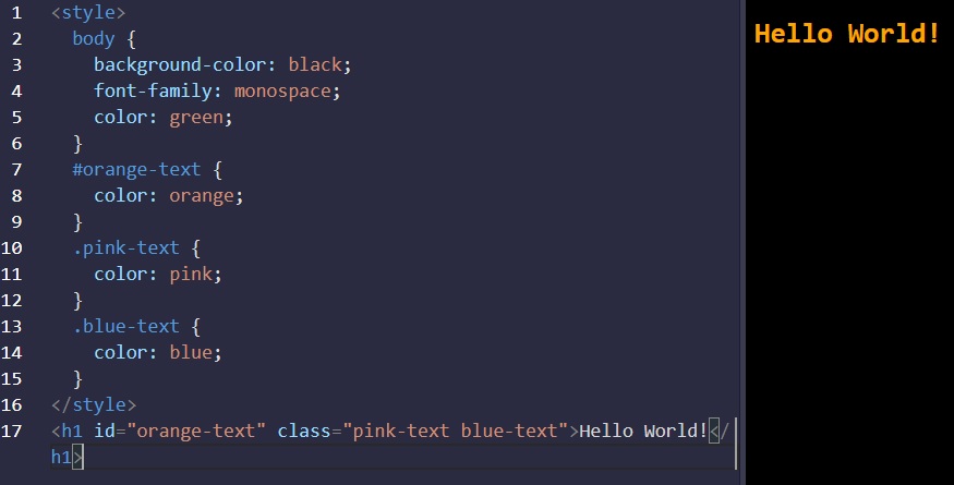
Use an id Attribute to Style an Element
One cool thing about id attributes is that, like classes, you can style them using CSS. However, an id is not reusable and should only be applied to one element. An id also has a higher specificity (importance) than a class so if both are applied to the same element and have conflicting styles, the styles of the id will be applied.
#green-bg-form { background-color: green; }
<form id="green-bg-form">...</form>
Priorities and Orders in CSS - Overriding styles
The order of priority in CSS:
!important tag>inline style>ids>classesand class declarations order >body inheritance
Examples:
- id attribute overrides class declarations and body inheritance:
- inline styles overrides ids, class declarations, and body inheritance
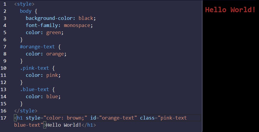
- override all styles by using
!important
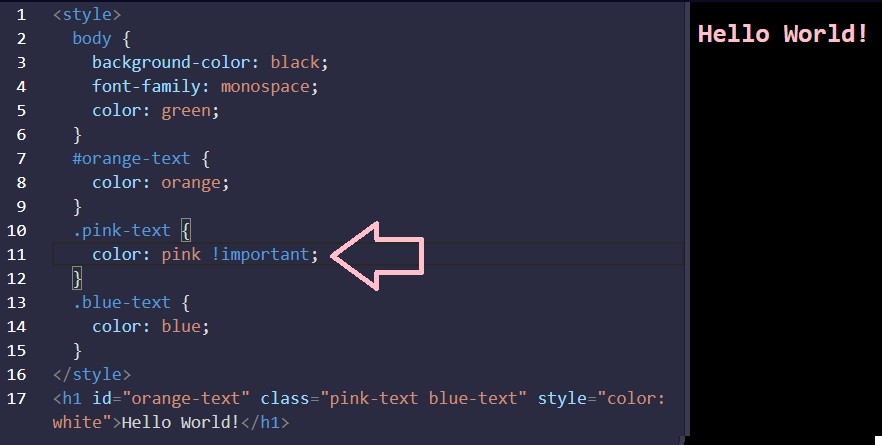
Use Attribute Selectors to Style Elements
Instead of id or class attributes (known as ID and class selectors), we can use [attr=value] attribute selector to style elements. This selector matches and styles elements with a specific attribute value.
[type="radio"] {
  margin: 20px 0px 20px 0px;
}
[type="checkbox"] {
  margin: 10px 0px 15px 0px;
}
Adjust padding and margin of an element
All HTML elements are essentially little rectangles. Three important properties control the space that surrounds each HTML element: padding, border, and margin.
An element’s padding controls the amount of space between the element’s content and its border. When you increase the blue box’s padding, it will increase the distance (padding) between the text and the border around it.
.red-box {
  background-color: crimson;
  color: #fff;
  padding: 20px;
}

.blue-box {
  background-color: blue;
  color: #fff;
  padding: 10px;
}
An element’s margin controls the amount of space between an element’s border and surrounding elements. When you increase the blue box’s margin, it will increase the distance between its border and surrounding elements.
.red-box {
  background-color: crimson;
  color: #fff;
  padding: 20px;
  margin: 20px;
}

.blue-box {
  background-color: blue;
  color: #fff;
  padding: 20px;
  margin: 10px;
}
<!-- Whole code from the examples above -->
<style>
  .injected-text {
    margin-bottom: -25px;
    text-align: center;
  }
  .box {
    border-style: solid;
    border-color: black;
    border-width: 5px;
    text-align: center;
  }
  .yellow-box {
    background-color: yellow;
    padding: 10px;
  }
  .red-box {
    background-color: crimson;
    color: #fff;
    padding: 20px;
    margin: 20px;
  }
  .blue-box {
    background-color: blue;
    color: #fff;
    padding: 20px;
    margin: 10px;
  }
</style>
<h5 class="injected-text">margin</h5>
<div class="box yellow-box">
  <h5 class="box red-box">padding</h5>
  <h5 class="box blue-box">padding</h5>
</div>
Negative Margin to an Element
An element’s margin controls the amount of space between an element’s border and surrounding elements. If you set an element’s margin to a negative value, the element will grow larger.
.red-box { background-color: crimson; color: #fff; padding: 20px; margin: -15px;
} .blue-box { background-color: blue; color: #fff; padding: 20px; margin: 20px;
}
Clockwise Notation to Specify the Padding/Margin of an Element
Instead of specifying an element’s padding-top, padding-right, padding-bottom, and padding-left properties individually, you can specify them all in one line, like this: padding: 10px 20px 10px 20px;.
Absolute Units versus Relative Units
The two main types of length units are absolute and relative.
Absolute units tie to physical units of length. For example, in and mm refer to inches and millimeters, respectively. Absolute length units approximate the actual measurement on a screen, but there are some differences depending on a screen’s resolution.
Relative units, such as em or rem, are relative to another length value. For example, em is based on the size of an element’s font. If you use it to set the font-size property itself, it’s relative to the parent’s font-size.
- Absolute Lengths: fixed, these will appear as exactly that size. Absolute length units are not recommended for use on screen, because screen sizes vary so much. However, they can be used if the output medium is known, such as for print layout.
cm: centimetersmm: millimetersin: inches (1in = 96px = 2.54cm)px *: pixels (1px = 1/96th of 1in)pt: points (1pt = 1/72 of 1in)pc: picas (1pc = 12 pt)
- Relative Lengths: length relative to another length property. Relative length units scale better between different rendering medium.
emRelative to the font-size of the element (2em means 2 times the size of the current font)exRelative to the x-height of the current font (rarely used)chRelative to the width of the “0” (zero)remRelative to font-size of the root elementvwRelative to 1% of the width of the viewport*vhRelative to 1% of the height of the viewport*vminRelative to 1% of viewport’s* smaller dimensionvmaxRelative to 1% of viewport’s* larger dimension%Relative to the parent element
CSS Variables
Variables in CSS are declared/defined with two dashes -- in front of their name. Variables can be accessed with var(--var-name)
<style>
  :root {
    --penguin-belly: pink;
  }

  body {
    background: var(--penguin-belly, #c6faf1);
  }

  .penguin {
    --penguin-skin: gray;
    --penguin-beak: orange;
    --penguin-belly: white; // you can also overwrite previous variable values
    position: relative;
    margin: auto;
    display: block;
    margin-top: 5%;
    width: 300px;
    height: 300px;
  }

  .right-cheek {
    top: 15%;
    left: 35%;
    background: var(
      --penguin-belly,
      white
    ); // white is an attached fallback value if the variable could not be accessed
    width: 60%;
    height: 70%;
    border-radius: 70% 70% 60% 60%;
  }

  .left-cheek {
    top: 15%;
    left: 5%;
    background: var(--penguin-belly, white);
    width: 60%;
    height: 70%;
    border-radius: 70% 70% 60% 60%;
  }

  .belly {
    top: 60%;
    left: 2.5%;
    background: var(--penguin-belly, white);
    width: 95%;
    height: 100%;
    border-radius: 120% 120% 100% 100%;
  }

  .penguin-top {
    top: 10%;
    left: 25%;
    background: var(--penguin-skin, gray);
    width: 50%;
    height: 45%;
    border-radius: 70% 70% 60% 60%;
  }

  .penguin-bottom {
    top: 40%;
    left: 23.5%;
    background: var(--penguin-skin, gray);
    width: 53%;
    height: 45%;
    border-radius: 70% 70% 100% 100%;
  }

  .right-hand {
    top: 0%;
    left: -5%;
    background: var(--penguin-skin, gray);
    width: 30%;
    height: 60%;
    border-radius: 30% 30% 120% 30%;
    transform: rotate(45deg);
    z-index: -1;
  }

  .left-hand {
    top: 0%;
    left: 75%;
    background: var(--penguin-skin, gray);
    width: 30%;
    height: 60%;
    border-radius: 30% 30% 30% 120%;
    transform: rotate(-45deg);
    z-index: -1;
  }

  .right-feet {
    top: 85%;
    left: 60%;
    background: var(--penguin-beak, orange);
    width: 15%;
    height: 30%;
    border-radius: 50% 50% 50% 50%;
    transform: rotate(-80deg);
    z-index: -2222;
  }

  .left-feet {
    top: 85%;
    left: 25%;
    background: var(--penguin-beak, orange);
    width: 15%;
    height: 30%;
    border-radius: 50% 50% 50% 50%;
    transform: rotate(80deg);
    z-index: -2222;
  }

  .right-eye {
    top: 45%;
    left: 60%;
    background: black;
    width: 15%;
    height: 17%;
    border-radius: 50%;
  }

  .left-eye {
    top: 45%;
    left: 25%;
    background: black;
    width: 15%;
    height: 17%;
    border-radius: 50%;
  }

  .sparkle {
    top: 25%;
    left: 15%;
    background: white;
    width: 35%;
    height: 35%;
    border-radius: 50%;
  }

  .blush-right {
    top: 65%;
    left: 15%;
    background: pink;
    width: 15%;
    height: 10%;
    border-radius: 50%;
  }

  .blush-left {
    top: 65%;
    left: 70%;
    background: pink;
    width: 15%;
    height: 10%;
    border-radius: 50%;
  }

  .beak-top {
    top: 60%;
    left: 40%;
    background: var(--penguin-beak, orange);
    width: 20%;
    height: 10%;
    border-radius: 50%;
  }

  .beak-bottom {
    top: 65%;
    left: 42%;
    background: var(--penguin-beak, orange);
    width: 16%;
    height: 10%;
    border-radius: 50%;
  }

  .penguin * {
    position: absolute;
  }
  // The CSS * selector selects all elements within .penguin
  // Therefore, all elements within element with .penguin will have absolute position
</style>
<div class="penguin">
  <div class="penguin-bottom">
    <div class="right-hand"></div>
    <div class="left-hand"></div>
    <div class="right-feet"></div>
    <div class="left-feet"></div>
  </div>
  <div class="penguin-top">
    <div class="right-cheek"></div>
    <div class="left-cheek"></div>
    <div class="belly"></div>
    <div class="right-eye">
      <div class="sparkle"></div>
    </div>
    <div class="left-eye">
      <div class="sparkle"></div>
    </div>
    <div class="blush-right"></div>
    <div class="blush-left"></div>
    <div class="beak-top"></div>
    <div class="beak-bottom"></div>
  </div>
</div>
Colors in CSS
color: #000 // black as abbreviated hex code
color: #F00 // red as abbreviated hex code
color: #FF0000 // red
color: #00FF00 // green
color: #0000FF // blue
color: #FFA500 // orange
color: rgb(255, 255, 255) // white as rgb color instead of HEX
color: rgb(0, 255, 255) // cyan
background-color: rgba(45, 45, 45, 0.1) // a = alpha/level of opacity
Or we can use hue, saturation, and lightness:
| Color | HSL |
|---|---|
| red | hsl(0, 100%, 50%) |
| yellow | hsl(60, 100%, 50%) |
| green | hsl(120, 100%, 50%) |
| cyan | hsl(180, 100%, 50%) |
| blue | hsl(240, 100%, 50%) |
| magenta | hsl(300, 100%, 50%) |
Note: All elements have a default background-color of transparent.
Colorful example using teal (#09A7A1) as the dominant color, and its orange (#FF790E) complement to visually highlight the sign-up buttons:
<style>
body {
background-color: white;
}
header {
background-color: #09a7a1;
color: white;
padding: 0.25em;
}
h2 {
color: #09a7a1;
}
button {
background-color: #ff790e;
}
footer {
background-color: #09a7a1;
color: white;
padding: 0.5em;
}
</style>
<header>
<h1>Cooking with FCC!</h1>
</header>
<main>
<article>
<h2>Machine Learning in the Kitchen</h2>
<p>
Join this two day workshop that walks through how to implement
cutting-edge snack-getting algorithms with a command line interface.
Coding usually involves writing exact instructions, but sometimes you need
your computer to execute flexible commands, like
<code>fetch Pringles</code>.
</p>
<button>Sign Up</button>
</article>
<article>
<h2>Bisection Vegetable Chopping</h2>
<p>
This week-long retreat will level-up your coding ninja skills to actual
ninja skills. No longer is the humble bisection search limited to sorted
arrays or coding interview questions, applying its concepts in the kitchen
will have you chopping carrots in O(log n) time before you know it.
</p>
<button>Sign Up</button>
</article>
</main>
<br />
<footer>© 2018 FCC Kitchen</footer>
Applied Visual Design
Visual Design in web development is a broad topic. It combines typography, color theory, graphics, animation, and page layout to help deliver a site’s message.
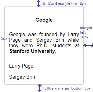
Text Alignment and Formatting in CSS
Text is often a large part of web content. CSS has several options for how to align it with the text-align property.
text-align: justify;causes all lines of text except the last line to meet the left and right edges of the line box.text-align: center;centers the texttext-align: right;right-aligns the texttext-align: left;(the default) left-aligns the text.
Example:
<style>
  h4 {
    text-align: center;
    height: 25px;
  }
  p {
    text-align: justify;
  }
  .links {
    text-align: left;
    color: black;
  }
  .fullCard {
    width: 245px;
    border: 1px solid #ccc;
    border-radius: 5px;
    margin: 10px 5px;
    padding: 4px;
  }
  .cardContent {
    padding: 10px;
  }
  .cardText {
    margin-bottom: 30px;
  }
</style>
<div class="fullCard">
  <div class="cardContent">
    <div class="cardText">
      <h4>Google</h4>
      <p>
        Google was founded by Larry Page and Sergey Brin while they were Ph.D.
        students at <strong>Stanford University</strong>.
      </p>
    </div>
    <div class="cardLinks">
      <a
        href="https://en.wikipedia.org/wiki/Larry_Page"
        target="_blank"
        class="links"
        >Larry Page</a
      ><br /><br />
      <a
        href="https://en.wikipedia.org/wiki/Sergey_Brin"
        target="_blank"
        class="links"
        >Sergey Brin</a
      >
    </div>
  </div>
</div>
Text Formatting
- bold:
<strong>Bold Text</strong>or CSS property:font-weight: bold; - underlined:
<u>Underlined Text</u>or CSS property:text-decoration: underline; - italic:
<em>Italic Text</em>or using CSS property:font-style: italic; -
strikethrough:
<s>Strikethrough Text</s>or CSS prop:text-decoration: line-through;
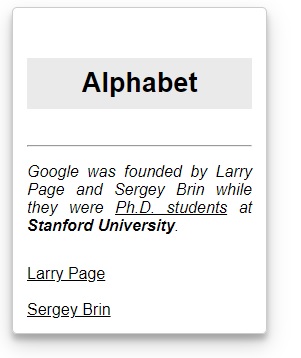
Box shadow and opacity of Elements
The box-shadow property applies one or more shadows to an element. The box-shadow property takes values for:
offset-x(how far to push the shadow horizontally from the element),offset-y(how far to push the shadow vertically from the element),blur-radius,spread-radiusandcolor, in that order.
The blur-radius and spread-radius values are optional.
Multiple box-shadows can be created by using commas to separate properties of each box-shadow element. Here’s an example of the CSS to create multiple shadows with some blur, at mostly-transparent black colors:
box-shadow: offset-x, offset-y, blur-radius(opt), spread-radius(opt), color;
box-shadow: 0 10px 20px rgba(0, 0, 0, 0.19), 0 6px 6px rgba(0, 0, 0, 0.23);
Example of box-shadow applied on a card with id="thumbnail":
<style>
  h4 {
    text-align: center;
    background-color: rgba(45, 45, 45, 0.1);
    padding: 10px;
    font-size: 27px;
  }
  p {
    text-align: justify;
  }
  .links {
    text-align: left;
    color: black;
  }
  #thumbnail {
    box-shadow: 0 10px 20px rgba(0, 0, 0, 0.19), 0 6px 6px rgba(0, 0, 0, 0.23);
  }
  .fullCard {
    width: 245px;
    border: 1px solid #ccc;
    border-radius: 5px;
    margin: 10px 5px;
    padding: 4px;
  }
  .cardContent {
    padding: 10px;
  }
  .cardText {
    margin-bottom: 30px;
  }
</style>
<div class="fullCard" id="thumbnail">
  <div class="cardContent">
    <div class="cardText">
      <h4>Alphabet</h4>
      <hr />
      <p>
        <em
          >Google was founded by Larry Page and Sergey Brin while they were
          <u>Ph.D. students</u> at <strong>Stanford University</strong>.</em
        >
      </p>
    </div>
    <div class="cardLinks">
      <a
        href="https://en.wikipedia.org/wiki/Larry_Page"
        target="_blank"
        class="links"
        >Larry Page</a
      ><br /><br />
      <a
        href="https://en.wikipedia.org/wiki/Sergey_Brin"
        target="_blank"
        class="links"
        >Sergey Brin</a
      >
    </div>
  </div>
</div>
Opacity of an Element
The opacity property in CSS is used to adjust the opacity, or conversely, the transparency for an item.
A value of 1 is opaque, which isn’t transparent at all. A value of 0.5 is half see-through. A value of 0 is completely transparent.
.links {
  text-align: left;
  color: black;
  opacity: 0.7;
}
Make a moon using box shadow and circle
<style>
  .center {
    position: absolute;
    margin: auto;
    top: 0;
    right: 0;
    bottom: 0;
    left: 0;
    width: 100px;
    height: 100px;
    background-color: transparent;
    border-radius: 50%;
    box-shadow: 25px 10px 0 0 blue;
  }
</style>
<div class="center"></div>
Text transform (uppercase, lowercase) and font size
The text-transform property in CSS is used to change the appearance of text. It’s a convenient way to make sure text on a webpage appears consistently, without having to change the text content of the actual HTML elements.
The following table shows how the different text-transformvalues change the example text “Transform me”.
| Value | Result |
|---|---|
lowercase |
“transform me” |
uppercase |
“TRANSFORM ME” |
capitalize |
“Transform Me” |
initial |
Use the default value |
inherit |
Use the text-transform value from the parent element |
none |
Default: Use the original text |
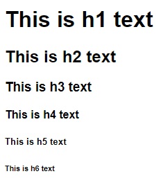
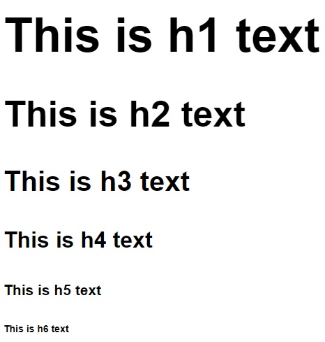
Font size
The font-size property is used to specify how large the text is in a given element. This rule can be used for multiple elements to create visual consistency of text on a page. In this challenge, you’ll set the values for all h1 through h6 tags to balance the heading sizes.
Default font sizes:
h1:   32px   (2em)
h2:   24px (1.5em)
h3: 20.8px (1.3em)
h4:   16px   (1em)
h5: 12.8px (0.8em)
h6: 11.2px (0.7em)
Default font sizes from html.css with the default style of Mozilla Firefox:
h1 {
  font-size: 2em;
}
h2 {
  font-size: 1.5em;
}
h3 {
  font-size: 1.17em;
}
h4 {
  font-size: 1em;
}

h5 {
  font-size: 0.83em;
}

h6 {
  font-size: 0.67em;
}
We can modify all those values with:
h1 {
  font-size: 68px;
}
h2 {
  font-size: 52px;
}
h3 {
  font-size: 40px;
}
h4 {
  font-size: 32px;
}

h5 {
  font-size: 21px;
}

h6 {
  font-size: 14px;
}
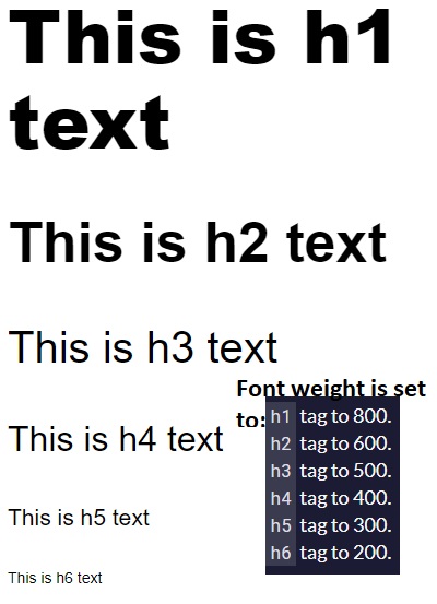
Font weight
The font-weight property sets how thick or thin characters are in a section of text.
h1 {
  font-size: 68px;
  font-weight: 800;
}
h2 {
  font-size: 52px;
  font-weight: 600;
}
h3 {
  font-size: 40px;
  font-weight: 500;
}
h4 {
  font-size: 32px;
  font-weight: 400;
}
h5 {
  font-size: 21px;
  font-weight: 300;
}
h6 {
  font-size: 14px;
  font-weight: 200;
}
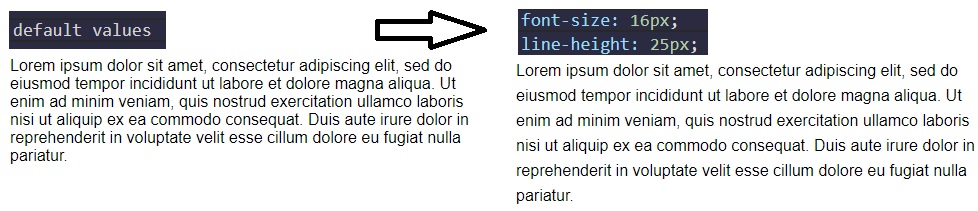
Font size of a paragraph and space between lines with line-height
p {
  font-size: 16px;
  line-height: 25px;
}
Relative Position, offsets, Absolute Position, Fixed Position
Block-level items automatically start on a new line (think headings, paragraphs, and divs) while inline items sit within surrounding content (like images or spans). The default layout of elements in this way is called the normal flow of a document, but CSS offers the position property to override it.
When the position of an element is set to relative, it allows you to specify how CSS should move it relative to its current position in the normal flow of the page.
Changing an element’s position to relative does not remove it from the normal flow - other elements around it still behave as if that item were in its default position. Note: Positioning gives you a lot of flexibility and power over the visual layout of a page. It’s good to remember that no matter the position of elements, the underlying HTML markup should be organized and make sense when read from top to bottom.
The following example moves the paragraph 10 pixels away from the bottom:
p {
  position: relative;
  bottom: 10px;
}
The following example moves the paragraph 15 pixels away from the top:
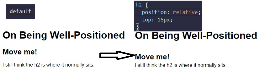
Relatively Positioned Element with CSS Offsets
The CSS offsets of top or bottom, and left or right tell the browser how far to offset an item relative to where it would sit in the normal flow of the document. You’re offsetting an element away from a given spot, which moves the element away from the referenced side (effectively, the opposite direction).
Use CSS offsets to move the h2 15 pixels to the right and 10 pixels up:
h2 {
  position: relative;
  left: 15px;
  bottom: 10px;
}
Absolute position in CSS
absolute property locks the element in place relative to its parent container. Unlike the relative position, absolute removes the element from the normal flow of the document, so surrounding items ignore it. The CSS offset properties (top or bottom and left or right) are used to adjust the position.
One nuance with absolute positioning is that it will be locked relative to its closest positioned ancestor. If you forget to add a position rule to the parent item, (this is typically done using position: relative;), the browser will keep looking up the chain and ultimately default to the body tag.
Absolute position is commonly used for search box.
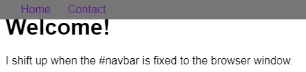
Fixed Position in CSS
fixed position locks an element relative to the browser window. Similar to absolute positioning, it’s used with the CSS offset properties and also removes the element from the normal flow of the document. Other items no longer “realize” where it is positioned, which may require some layout adjustments elsewhere.
One key difference between the fixed and absolute positions is that an element with a fixed position won’t move when the user scrolls.
Fixed position is commonly used for Navigation bar.
<style>
  body {
    min-height: 150vh;
  }
  #navbar {
    position: fixed;
    top: 0;
    left: 0;
    width: 100%;
    background-color: #767676;
  }
  nav ul {
    margin: 0px;
    padding: 5px 0px 5px 30px;
  }
  nav li {
    display: inline;
    margin-right: 20px;
  }
  a {
    text-decoration: none;
  }
</style>
<body>
  <header>
    <h1>Welcome!</h1>
    <nav id="navbar">
      <ul>
        <li><a href="">Home</a></li>
        <li><a href="">Contact</a></li>
      </ul>
    </nav>
  </header>
  <p>I shift up when the #navbar is fixed to the browser window.</p>
</body>
Center an Element Horizontally Using the margin Property
Another positioning technique is to center a block element horizontally. One way to do this is to set its margin to a value of auto.
This method works for images, too. Images are inline elements by default, but can be changed to block elements when you set the display property to block.
div {
  margin: 0 auto 0 auto;
}
Or simply:
div {
  margin: auto;
}
Gradual CSS Linear Gradient
Syntax:
background: linear-gradient(gradient_direction, color 1, color 2, color 3, ...);
The first argument specifies the direction from which color transition starts - it can be stated as a degree, where 90deg makes a horizontal gradient (from left to right) and 45deg makes a diagonal gradient (from bottom left to top right).
Example of using it:
background: linear-gradient(90deg, red, yellow, rgb(204, 204, 255));
Another example:
<style>
  div {
    border-radius: 20px;
    width: 70%;
    height: 400px;
    margin: 50px auto;
    background: linear-gradient(35deg, #ccffff, #ffcccc);
  }
</style>

<div></div>
More examples:
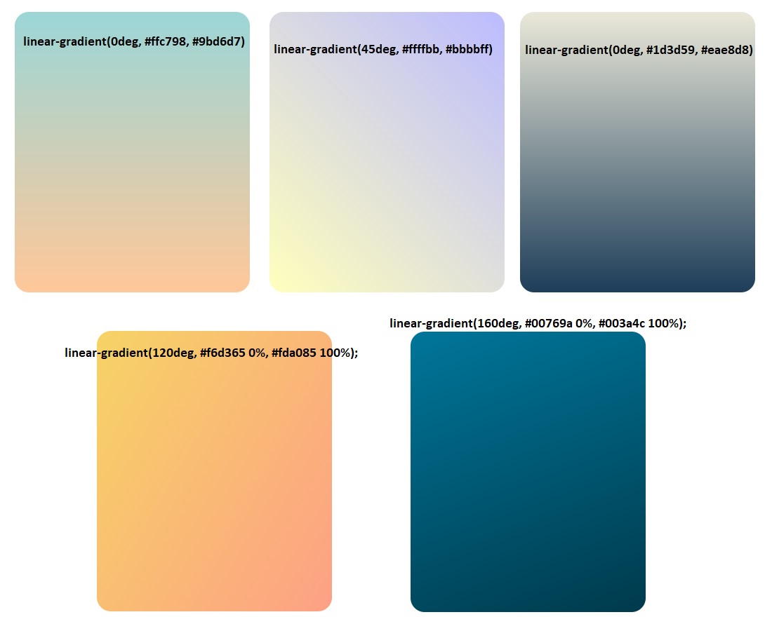
CSS Gradient Tools:
- cssgradient.io
- cssgradient.io/gradient-backgrounds/
- mycolor.space
- Shape generator for backgrounds - bennettfeely.com/clippy
CSS Linear Gradient to Create a Striped Element
<style>
  div {
    border-radius: 20px;
    width: 70%;
    height: 400px;
    margin: 50 auto;
    background: repeating-linear-gradient(
      90deg,
      yellow 0px,
      blue 40px,
      green 40px,
      red 80px
    );
  }
</style>

<div></div>
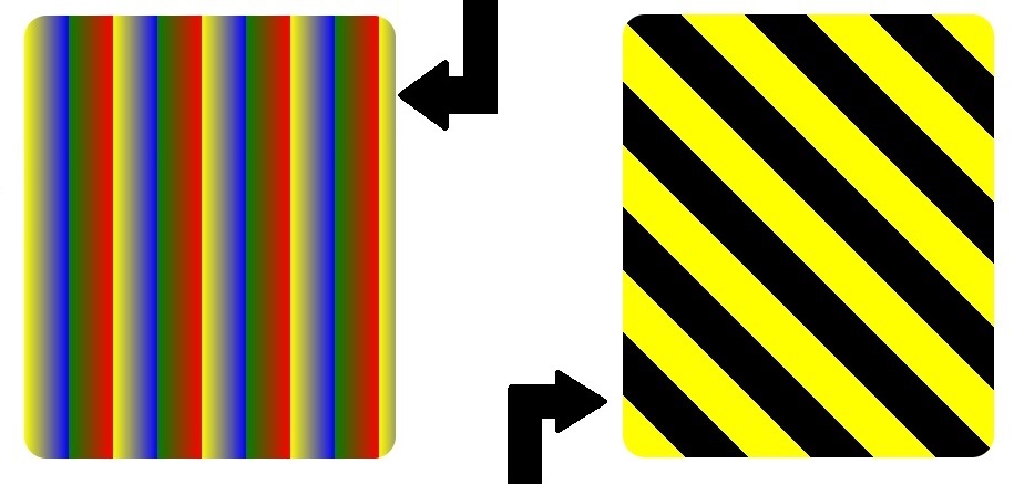
<style>
  div {
    border-radius: 20px;
    width: 70%;
    height: 400px;
    margin: 50 auto;
    background: repeating-linear-gradient(
      45deg,
      yellow 0px,
      yellow 40px,
      black 40px,
      black 80px
    );
  }
</style>

<div></div>
Subtle Pattern as a Background Image using a PNG Texture
One way to add texture and interest to a background and have it stand out more is to add a subtle pattern.
body {
  background: url(https://cdn-media-1.freecodecamp.org/imgr/MJAkxbh.png);
}
Other Example of Linear Gradient
body {
  height: 100%;
  background: rgb(70, 184, 167);
  background: radial-gradient(
    circle,
    rgba(70, 184, 167, 1) 0%,
    rgba(55, 80, 219, 1),
    100%
  );
}

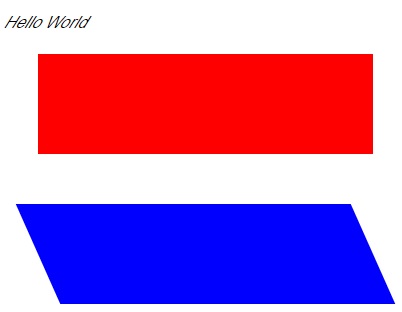
CSS Transform Property: scale, move, rotate and skew
The transform property has a variety of functions that let you scale, move, rotate, skew, etc., your elements. When used with pseudo-classes such as :hover that specify a certain state of an element, the transform property can easily add interactivity to your elements.
<style>
  div {
    width: 70%;
    height: 100px;
    margin: 50px auto;
    background: linear-gradient(53deg, #ccfffc, #ffcccf);
  }
  div:hover {
    transform: scale(1.1);
  }
</style>

<div></div>
The following code skews the paragraph element by -32 degrees along the X-axis.
p {
  transform: skewX(-32deg);
}
The following code skews the element with the id of bottom by 24 degrees along the X-axis
<style>
  div {
    width: 70%;
    height: 100px;
    margin: 50px auto;
  }
  #top {
    background-color: red;
  }
  #bottom {
    background-color: blue;
    transform: skewX(24deg);
  }
</style>

<p>Hello World</p>
<div id="top"></div>
<div id="bottom"></div>
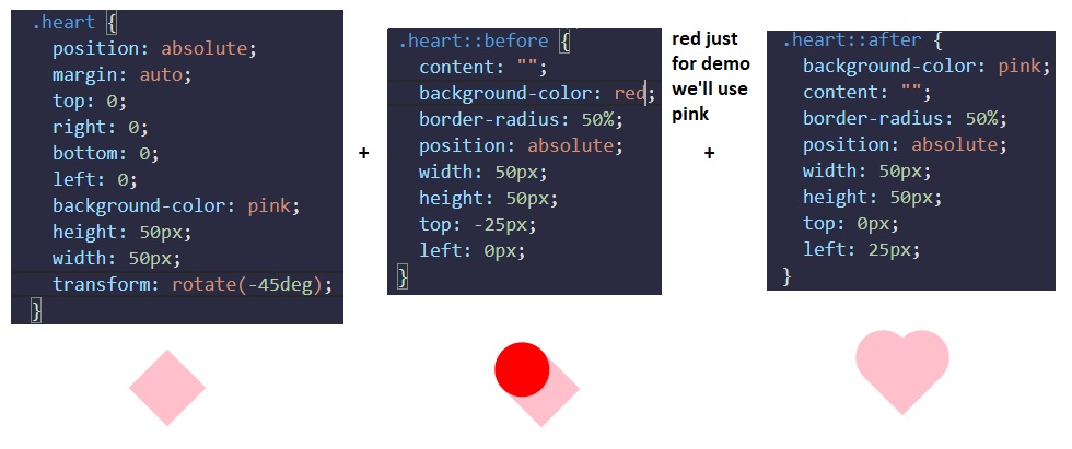
More Complex Shape Using CSS, ::before and ::after pseudo-elements
::before and ::after pseudo-elements are used to add something before or after a selected element. In the following example, a ::before pseudo-element is used to add a rectangle to an element with the class heart:
.heart::before {
  content: "";
  background-color: yellow;
  border-radius: 25%;
  position: absolute;
  height: 50px;
  width: 70px;
  top: -50px;
  left: 5px;
}
For the ::before and ::after pseudo-elements to function properly, they must have a defined content property. This property is usually used to add things like a photo or text to the selected element. When the ::before and ::after pseudo-elements are used to make shapes, the content property is still required, but it’s set to an empty string. In the above example, the element with the class of heart has a ::before pseudo-element that produces a yellow rectangle with height and width of 50px and 70px, respectively. This rectangle has round corners due to its 25% border radius and is positioned absolutely at 5px from the left and 50px above the top of the element.
Complete example for a heart shape:
<style>
  .heart {
    position: absolute;
    margin: auto;
    top: 0;
    right: 0;
    bottom: 0;
    left: 0;
    background-color: pink;
    height: 50px;
    width: 50px;
    transform: rotate(-45deg);
  }
  .heart::before {
    content: "";
    background-color: pink;
    border-radius: 50%;
    position: absolute;
    width: 50px;
    height: 50px;
    top: -25px;
    left: 0px;
  }
  .heart::after {
    background-color: pink;
    content: "";
    border-radius: 50%;
    position: absolute;
    width: 50px;
    height: 50px;
    top: 0px;
    left: 25px;
  }
</style>
<div class="heart"></div>
CSS Animations, @keyframes and Animation Properties
The animation properties control how the animation should behave and the @keyframes rule controls what happens during that animation. There are eight animation properties in total.
- animation-name
- animation-duration
- animation-timing-function
- animation-delay
- animation-iteration-count
- animation-direction
- animation-fill-mode
- animation-play-state
(Link to w3schools.com - CSS Animations)
animation-name sets the name of the animation, which is later used by @keyframes to tell CSS which rules go with which animations.
animation-duration sets the length of time for the animation.
@keyframes is how to specify exactly what happens within the animation over the duration. This is done by giving CSS properties for specific “frames” during the animation, with percentages ranging from 0% to 100%. If you compare this to a movie, the CSS properties for 0% is how the element displays in the opening scene. The CSS properties for 100% is how the element appears at the end. Then CSS applies the magic to transition the element over the given duration to act out the scene. Here’s an example to illustrate the usage of @keyframes and the animation properties. Simple example:
#anim {
  animation-name: colorful;
  animation-duration: 3s;
}

@keyframes colorful {
  0% {
    background-color: blue;
  }
  100% {
    background-color: yellow;
  }
}
For the element with the anim id, the code snippet above sets the animation-name to colorful and sets the animation-duration to 3 seconds. Then the @keyframes rule links to the animation properties with the name colorful. It sets the color to blue at the beginning of the animation (0%) which will transition to yellow by the end of the animation (100%). You aren’t limited to only beginning-end transitions, you can set properties for the element for any percentage between 0% and 100%.
You can also combine starting and ending properties:
@keyframes fontbulger {
  0%,
  100% {
    font-size: 10px;
  }
  50% {
    font-size: 12px;
  }
}
Use CSS Animation to Change the Hover State of a Button
If we just apply keyframes to a button, after the animation-duration, the color / state of the button will reset (causing the button to revert to the original color/size/etc.). If we want the button to stay highlighted, we need to set animation-fill-mode property to forwards. The animation-fill-mode specifies the style applied to an element when the animation has finished.
<style>
  button {
    border-radius: 5px;
    color: white;
    background-color: #0f5897;
    padding: 5px 10px 8px 10px;
  }
  button:hover {
    animation-name: background-color;
    animation-duration: 500ms;
    animation-fill-mode: forwards;
  }
  @keyframes background-color {
    100% {
      background-color: #4791d0;
    }
  }
</style>
<button>Register</button>
Create Movement Using CSS Animation
When elements have a specified position, such as fixed or relative, the CSS offset properties right, left, top, and bottom can be used in animation rules to create movement.
<style>
  div {
    height: 40px;
    width: 70%;
    background: black;
    margin: 50px auto;
    border-radius: 5px;
    position: relative;
  }

  #rect {
    animation-name: rainbow;
    animation-duration: 4s;
  }

  @keyframes rainbow {
    0% {
      background-color: blue;
      top: 0px;
      left: 0px;
    }
    50% {
      background-color: green;
      top: 50px;
      left: 25px;
    }
    100% {
      background-color: yellow;
      top: 0px;
      left: -25px;
    }
  }
</style>

<div id="rect"></div>
Animate Elements Continually Using an Infinite Animation Count
The animation-iteration-count property specifies the number of times an animation should run.
<style>
  #ball {
    width: 100px;
    height: 100px;
    margin: 50px auto;
    position: relative;
    border-radius: 50%;
    background: linear-gradient(35deg, #ccffff, #ffcccc);
    animation-name: bounce;
    animation-duration: 1s;
    animation-iteration-count: infinite;
  }

  @keyframes bounce {
    0% {
      top: 0px;
    }
    50% {
      top: 249px;
      width: 130px;
      height: 70px;
    }
    100% {
      top: 0px;
    }
  }
</style>
<div id="ball"></div>
CSS Heartbeat using an Infinite Animation Count
The one-second long heartbeat animation consists of two animated pieces. The heart elements (including the :before and :after pieces) are animated to change size using the transform property, and the background div is animated to change its color using the background property.
The heart:before and heart:after selectors do not need any animation properties.
<style>
  .back {
    position: fixed;
    padding: 0;
    margin: 0;
    top: 0;
    left: 0;
    width: 100%;
    height: 100%;
    background: white;
    animation-name: backdiv;
    animation-duration: 1s;
    animation-iteration-count: infinite;
  }

  .heart {
    position: absolute;
    margin: auto;
    top: 0;
    right: 0;
    bottom: 0;
    left: 0;
    background-color: pink;
    height: 50px;
    width: 50px;
    transform: rotate(-45deg);
    animation-name: beat;
    animation-duration: 1s;
    animation-iteration-count: infinite;
  }
  .heart:after {
    background-color: pink;
    content: "";
    border-radius: 50%;
    position: absolute;
    width: 50px;
    height: 50px;
    top: 0px;
    left: 25px;
  }
  .heart:before {
    background-color: pink;
    content: "";
    border-radius: 50%;
    position: absolute;
    width: 50px;
    height: 50px;
    top: -25px;
    left: 0px;
  }

  @keyframes backdiv {
    50% {
      background: #ffe6f2;
    }
  }

  @keyframes beat {
    0% {
      transform: scale(1) rotate(-45deg);
    }
    50% {
      transform: scale(0.6) rotate(-45deg);
    }
  }
</style>
<div class="back"></div>
<div class="heart"></div>
Change Animation Timing with Keywords
In CSS animations, the animation-timing-function property controls how quickly an animated element changes over the duration of the animation. If the animation is a car moving from point A to point B in a given time (your animation-duration), the animation-timing-function says how the car accelerates and decelerates over the course of the drive.
The animation-timing-function property specifies the speed curve of the animation. The animation-timing-function property can have the following values:
ease- Specifies an animation with a slow start, then fast, then end slowly (this is default)linear- Specifies an animation with the same speed from start to endease-in- Specifies an animation with a slow startease-out- Specifies an animation with a slow endease-in-out- Specifies an animation with a slow start and endcubic-bezier(n,n,n,n)- Lets you define your own values in a cubic-bezier function. We can use cubic-bezier.com in order to easily create custom animations using bezier.
Example from freeCodeCamp:
<style>
  .balls {
    border-radius: 50%;
    background: linear-gradient(35deg, #ccffff, #ffcccc);
    position: fixed;
    width: 50px;
    height: 50px;
    margin-top: 50px;
    animation-name: bounce;
    animation-duration: 2s;
    animation-iteration-count: infinite;
  }
  #ball1 {
    left: 27%;
    animation-timing-function: linear;
  }
  #ball2 {
    left: 56%;
    animation-timing-function: ease-out;
  }
  #ball3 {
    left: 80%;
  }

  @keyframes bounce {
    0% {
      top: 0px;
    }
    100% {
      top: 249px;
    }
  }
</style>

<div class="balls" id="ball1"></div>
<div class="balls" id="ball2"></div>
<div class="balls" id="ball3"></div>
Animation Shorthand Property
The example below uses six of the animation properties:
div {
  animation-name: example;
  animation-duration: 5s;
  animation-timing-function: linear;
  animation-delay: 2s;
  animation-iteration-count: infinite;
  animation-direction: alternate;
}
The same animation effect as above can be achieved by using the shorthand animation property:
div {
  animation: example 5s linear 2s infinite alternate;
}
CSS Transitions
CSS transitions allows you to change property values smoothly, over a given duration. CSS Transitions have the following properties:
transitiontransition-delaytransition-durationtransition-propertytransition-timing-function
To create a transition effect, you must specify two things:
- the CSS property you want to add an effect to
- the duration of the effect
Note: If the duration part is not specified, the transition will have no effect, because the default value is 0.
<style>
  div {
    width: 100px;
    height: 100px;
    background: red;
    transition: width 1s;
  }

  // The transition effect will start when the specified CSS property (width) changes value.
  // We will change the value of width by using :hover

  div:hover {
    width: 300px;
  }
</style>
<div></div>
We can also change multiple property values simultaneously:
div {
  width: 100px;
  height: 100px;
  background: red;
  transition: width 2s, height 4s;
}
div:hover {
  width: 300px;
  height: 300px;
}
Specify the Speed Curve of the Transition
The transition-timing-function property specifies the speed curve of the transition effect.
The transition-timing-function property can have the following values:
ease- specifies a transition effect with a slow start, then fast, then end slowly (this is default)linear- specifies a transition effect with the same speed from start to endease-in- specifies a transition effect with a slow startease-out- specifies a transition effect with a slow endease-in-out- specifies a transition effect with a slow start and endcubic-bezier(n,n,n,n)- lets you define your own values in a cubic-bezier function
#div1 {
  transition-timing-function: linear;
}
#div2 {
  transition-timing-function: ease;
}
#div3 {
  transition-timing-function: ease-in;
}
#div4 {
  transition-timing-function: ease-out;
}
#div5 {
  transition-timing-function: ease-in-out;
}
Delay the Transition Effect
The transition-delay property specifies a delay (in seconds) for the transition effect.
div {
  transition-delay: 1s;
}
Transition + Transformation
<style>
div {
  width: 100px;
  height: 100px;
  background: red;
  transition: width 2s, height 2s, transform 2s;
}
div:hover {
  width: 300px;
  height: 300px;
  transform: rotate(180deg);
}
</style>

<div></div>
Transition Shorthand property
The CSS transition properties can be specified one by one, like this:
div {
  transition-property: width;
  transition-duration: 2s;
  transition-timing-function: linear;
  transition-delay: 1s;
}
or by using the shorthand property transition:
div {
  transition: width 2s linear 1s;
}
Applied Accessibility
“Accessibility” generally means having web content and a user interface that can be understood, navigated, and interacted with by a broad audience. This includes people with visual, auditory, mobility, or cognitive disabilities.
Here are three general concepts this section will explore throughout the following challenges:
- have well-organized code that uses appropriate markup
- ensure text alternatives exist for non-text and visual content
- create an easily-navigated page that’s keyboard-friendly
Having accessible web content is an ongoing challenge. A great resource for your projects going forward is the W3 Consortium’s Web Content Accessibility Guidelines (WCAG). They set the international standard for accessibility and provide a number of criteria you can use to check your work.
Alt attribute on images and Headings
Alt text describes the content of the image and provides a text-alternative for it. This helps in cases where the image fails to load or can’t be seen by a user. It’s also used by search engines to understand what an image contains to include it in search results.
<img src="importantLogo.jpeg" alt="Company logo" />
People with visual impairments rely on screen readers to convert web content to an audio interface. They won’t get information if it’s only presented visually. For images, screen readers can access the alt attribute and read its contents to deliver key information.
Good alt text provides the reader a brief description of the image. You should always include an alt attribute on your image. Per HTML5 specification, this is now considered mandatory.
However, sometimes images are grouped with a caption already describing them, or are used for decoration only. In these cases alt text may seem redundant or unnecessary.
n situations when an image is already explained with text content, or does not add meaning to a page, the img still needs an alt attribute, but it can be set to an empty string.
<img src="visualDecoration.jpeg" alt="" />
Background images usually fall under the ‘decorative’ label as well. However, they are typically applied with CSS rules, and therefore not part of the markup screen readers process.
Note: For images with a caption, you may still want to include alt text, since it helps search engines catalog the content of the image.
Hierarchical Relationships of Content with Headings
Headings (h1 through h6 elements) are workhorse tags that help provide structure and labeling to your content. Screen readers can be set to read only the headings on a page so the user gets a summary.
Headings with equal (or higher) rank start new implied sections, headings with lower rank start subsections of the previous one.
As an example, a page with an h2 element followed by several subsections labeled with h4 tags would confuse a screen reader user. With six choices, it’s tempting to use a tag because it looks better in a browser, but you can use CSS to edit the relative sizing.
One final point, each page should always have one (and only one) h1 element, which is the main subject of your content. This and the other headings are used in part by search engines to understand the topic of the page.
Note: Google Lighthouse Analysis will tell if you don’t use Headings in a correctly hierarchical structure.
Good example:
<h1>How to Become a Ninja</h1>
<main>
  <h2>Learn the Art of Moving Stealthily</h2>
  <h3>How to Hide in Plain Sight</h3>
  <h3>How to Climb a Wall</h3>

  <h2>Learn the Art of Living with Honor</h2>
  <h3>How to Breathe Properly</h3>
  <h3>How to Simplify your Life</h3>
</main>
Main, Header, Article, Section, Nav, Footer tags
HTML5 (released on 28 October 2014) introduced a number of new elements that give developers more options while also incorporating accessibility features. These tags include main, header, footer, nav, article, and section, among others.
By default, a browser renders these elements similarly to the humble div. However, using them where appropriate gives additional meaning in your markup. The tag name alone can indicate the type of information it contains, which adds semantic meaning to that content. Assistive technologies can access this information to provide better page summary or navigation options to their users.
The main element is used to wrap (you guessed it) the main content, and there should be only one per page. It’s meant to surround the information that’s related to the central topic of your page. It’s not meant to include items that repeat across pages, like navigation links or banners.
The article sectioning element is used to wrap independent, self-contained content. The tag works well with blog entries, forum posts, or news articles.
The section element is also new with HTML5, and has a slightly different semantic meaning than article. An article is for standalone content, and a section is for grouping thematically related content. They can be used within each other, as needed. For example, if a book is the article, then each chapter is a section. When there’s no relationship between groups of content, then use a div.
<div>
  - groups content
  <section>
    - groups related content
    <article>- groups independent, self-contained content</article>
  </section>
</div>
Example:
<h1>Deep Thoughts with Master Camper Cat</h1>
<main>
  <article>
    <h2>The Garfield Files: Lasagna as Training Fuel?</h2>
    <p>
      The internet is littered with varying opinions on nutritional paradigms,
      from catnip paleo to hairball cleanses. But let's turn our attention to an
      often overlooked fitness fuel, and examine the protein-carb-NOM trifecta
      that is lasagna...
    </p>
  </article>

  <article>
    <h2>Defeating your Foe: the Red Dot is Ours!</h2>
    <p>
      Felines the world over have been waging war on the most persistent of
      foes. This red nemesis combines both cunning stealth and lightning speed.
      But chin up, fellow fighters, our time for victory may soon be near...
    </p>
  </article>
</main>
The next HTML5 element that adds semantic meaning and improves accessibility is the header tag. It’s used to wrap introductory information or navigation links for its parent tag and works well around content that’s repeated at the top on multiple pages.
header shares the embedded landmark feature you saw with main, allowing assistive technologies to quickly navigate to that content.
Note: The header is meant for use in the body tag of your HTML document. This is different than the head element, which contains the page’s title, meta information, etc.
Example:
<head>
<title>Camper Cat Adventures</title>
</head>
<body>
<header>
<h1>Training with Camper Cat</h1>
</header>
<main>
<section id="stealth">
<h2>Stealth & Agility Training</h2>
<article>
<h3>Climb foliage quickly using a minimum spanning tree approach</h3>
</article>
<article><h3>No training is NP-complete without parkour</h3></article>
</section>
</main>
</body>
The nav element is another HTML5 item with the embedded landmark feature for easy screen reader navigation. This tag is meant to wrap around the main navigation links in your page.
<head>
<title>Camper Cat Adventures</title>
</head>
<body>
<header>
<h1>Training with Camper Cat</h1>
<nav>
<ul>
<li><a href="#stealth">Stealth & Agility</a></li>
<li><a href="#combat">Combat</a></li>
<li><a href="#weapons">Weapons</a></li>
</ul>
</nav>
</header>
<main>
<section id="stealth">
<h2>Stealth & Agility Training</h2>
<article>
<h3>Climb foliage quickly using a minimum spanning tree approach</h3>
</article>
<article><h3>No training is NP-complete without parkour</h3></article>
</section>
<section id="weapons">
<h2>Weapons Training</h2>
<article>
<h3>Swords: the best tool to literally divide and conquer</h3>
</article>
<article>
<h3>Breadth-first or depth-first in multi-weapon training?</h3>
</article>
</section>
<section id="weapons">
<h2>Weapons Training</h2>
<article>
<h3>Swords: the best tool to literally divide and conquer</h3>
</article>
<article>
<h3>Breadth-first or depth-first in multi-weapon training?</h3>
</article>
</section>
</main>
<footer>© 2018 Camper Cat</footer>
</body>
The footer element has a built-in landmark feature that allows assistive devices to quickly navigate to it. It’s primarily used to contain copyright information or links to related documents that usually sit at the bottom of a page.
Audio Element, Figure Element, Label Element
Improve Accessibility of Audio Content with the audio Element
HTML5’s audio element gives semantic meaning when it wraps sound or audio stream content in your markup. Audio content also needs a text alternative to be accessible to people who are deaf or hard of hearing. This can be done with nearby text on the page or a link to a transcript.
The audio tag supports the controls attribute. This shows the browser default play, pause, and other controls, and supports keyboard functionality. This is a boolean attribute, meaning it doesn’t need a value, its presence on the tag turns the setting on.
<main>
  <p>A sound clip of Zersiax's screen reader in action.</p>
  <audio controls>
    <source
      src="https://s3.amazonaws.com/freecodecamp/screen-reader.mp3"
      type="audio/mpeg"
    />
  </audio>
</main>
This code will render:
Note: Multimedia content usually has both visual and auditory components. It needs synchronized captions and a transcript so users with visual and/or auditory impairments can access it. Generally, a web developer is not responsible for creating the captions or transcript, but needs to know to include them.
Improve Chart Accessibility with the figure Element
HTML5 introduced the figure element, along with the related figcaption. Used together, these items wrap a visual representation (like an image, diagram, or chart) along with its caption. This gives a two-fold accessibility boost by both semantically grouping related content, and providing a text alternative that explains the figure.
For data visualizations like charts, the caption can be used to briefly note the trends or conclusions for users with visual impairments. Another challenge covers how to move a table version of the chart’s data off-screen (using CSS) for screen reader users.
<figure>
  <img src="Stacked-bar-chart-will-go-here.jpeg" alt="Stacked bar chart" />
  <br />
  <figcaption>
    Master Camper Cat demonstrates proper form of a roundhouse kick.
  </figcaption>
</figure>
Improve Form Field Accessibility with the label Element
The label tag wraps the text for a specific form control item, usually the name or label for a choice. This ties meaning to the item and makes the form more readable. The for attribute on a label tag explicitly associates that label with the form control and is used by screen readers.
You learned about radio buttons and their labels in a lesson in the Basic HTML section. In that lesson, we wrapped the radio button input element inside a label element along with the label text in order to make the text clickable. Another way to achieve this is by using the for attribute as explained in this lesson.
The value of the for attribute must be the same as the value of the id attribute of the form control. Here’s an example:
<form>
  <label for="name">Name:</label>
  <input type="text" id="name" name="name" />

  <label for="email">Email:</label>
  <input type="text" id="email" name="name" />
</form>
Wrap Radio Buttons in a fieldset Element for Better Accessibility
The next form topic covers accessibility of radio buttons. Each choice is given a label with a for attribute tying to the id of the corresponding item as covered in the last challenge. Since radio buttons often come in a group where the user must choose one, there’s a way to semantically show the choices are part of a set.
The fieldset tag surrounds the entire grouping of radio buttons to achieve this. It often uses a legend tag to provide a description for the grouping, which is read by screen readers for each choice in the fieldset element.
The fieldset wrapper and legend tag are not necessary when the choices are self-explanatory, like a gender selection. Using a label with the for attribute for each radio button is sufficient.
<form>
  <fieldset>
    <legend>Choose one of these three items:</legend>
    <input id="one" type="radio" name="items" value="one" />
    <label for="one">Choice One</label><br />
    <input id="two" type="radio" name="items" value="two" />
    <label for="two">Choice Two</label><br />
    <input id="three" type="radio" name="items" value="three" />
    <label for="three">Choice Three</label>
  </fieldset>
</form>
Date Picker as Input
Forms often include the input field, which can be used to create several different form controls. The type attribute on this element indicates what kind of input will be created.
HTML5 introduced an option to specify a date field. Depending on browser support, a date picker shows up in the input field when it’s in focus, which makes filling in a form easier for all users. For older browsers, the type will default to text, so it helps to show users the expected date format in the label or as placeholder text just in case.
<h1>Tournaments</h1>
<form>
  <p>Tell us the best date for the competition</p>
  <label for="pickdate">Preferred Date:</label>
  <input type="date" id="pickdate" name="date" />
  <input type="submit" name="submit" value="Submit" />
</form>
Standardize Times with the HTML5 datetime Attribute
Continuing with the date theme, HTML5 also introduced the time element along with a datetime attribute to standardize times. This is an inline element that can wrap a date or time on a page. A valid format of that date is held by the datetime attribute. This is the value accessed by assistive devices. It helps avoid confusion by stating a standardized version of a time, even if it’s written in an informal or colloquial manner in the text.
<p>
  Master Camper Cat officiated the cage match between Goro and Scorpion
  <time datetime="2013-02-13">last Wednesday</time>, which ended in a draw.
</p>
Another example:
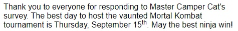
<p>
  Thank you to everyone for responding to Master Camper Cat's survey. The best
  day to host the vaunted Mortal Kombat tournament is
  <time datetime="2016-09-15">Thursday, September 15<sup>th</sup></time
  >. May the best ninja win!
</p>
Custom CSS to improve Accessibility
CSS’s magic can also improve accessibility on your page when you want to visually hide content meant only for screen readers (sr).
.sr-only {
  position: absolute;
  left: -10000px;
  width: 1px;
  height: 1px;
  top: auto;
  overflow: hidden;
}
Note: The following CSS approaches will NOT do the same thing:
display: none;orvisibility: hidden;hides content for everyone, including screen reader users- Zero values for pixel sizes, such as
width: 0px; height: 0px;removes that element from the flow of your document, meaning screen readers will ignore it
Improve Readability with High Contrast Text
Low contrast between the foreground and background colors can make text difficult to read. Sufficient contrast improves the readability of your content, but what exactly does “sufficient” mean?
The Web Content Accessibility Guidelines (WCAG) recommend at least a 4.5 to 1 contrast ratio for normal text. The ratio is calculated by comparing the relative luminance values of two colors. This ranges from 1:1 for the same color, or no contrast, to 21:1 for white against black, the strongest contrast.
Contrast checking tools:
- coolors.co/contrast-checker
- colorsafe.co - automatically suggests text colors based on background input
- color.review
Anchor links, accesskey and tabindex
Give Links Meaning by Using Descriptive Link Text
Screen reader users have different options for what type of content their device reads. This includes skipping to (or over) landmark elements, jumping to the main content, or getting a page summary from the headings. Another option is to only hear the links available on a page.
Screen readers do this by reading the link text, or what’s between the anchor (a) tags. Having a list of “click here” or “read more” links isn’t helpful. Instead, you should use brief but descriptive text within the a tags to provide more meaning for these users.
The link text that Camper Cat is using is not very descriptive without the surrounding context. Move the anchor (a) tags so they wrap around the text “information about batteries” instead of “Click here”.
<body>
  <header>
    <h1>Deep Thoughts with Master Camper Cat</h1>
  </header>
  <article>
    <h2>Defeating your Foe: the Red Dot is Ours!</h2>
    <p>
      Felines the world over have been waging war on the most persistent of
      foes. This red nemesis combines both cunning stealth and lightning speed.
      But chin up, fellow fighters, our time for victory may soon be near. Click
      here for <a href="">information about batteries</a>
    </p>
  </article>
</body>
Make Links Navigable with HTML Access Keys
TML offers the accesskey attribute to specify a shortcut key to activate or bring focus to an element. This can make navigation more efficient for keyboard-only users.
HTML5 allows this attribute to be used on any element, but it’s particularly useful when it’s used with interactive ones. This includes links, buttons, and form controls.
<button accesskey="b">Important Button</button>
Camper Cat wants the links around the two blog article titles to have keyboard shortcuts so his site’s users can quickly navigate to the full story. Add an accesskey attribute to both links and set the first one to “g” (for Garfield) and the second one to “c” (for Chuck Norris).
<body>
  <header>
    <h1>Deep Thoughts with Master Camper Cat</h1>
  </header>
  <article>
    <h2>
      <a accesskey="g" id="first" href="#"
        >The Garfield Files: Lasagna as Training Fuel?</a
      >
    </h2>
    <p>
      The internet is littered with varying opinions on nutritional paradigms,
      from catnip paleo to hairball cleanses. But let's turn our attention to an
      often overlooked fitness fuel, and examine the protein-carb-NOM trifecta
      that is lasagna...
    </p>
  </article>
</body>
Use tabindex to Add Keyboard Focus to an Element
The HTML tabindex attribute has three distinct functions relating to an element’s keyboard focus. When it’s on a tag, it indicates that element can be focused on. The value (an integer that’s positive, negative, or zero) determines the behavior.
Certain elements, such as links and form controls, automatically receive keyboard focus when a user tabs through a page. It’s in the same order as the elements come in the HTML source markup. This same functionality can be given to other elements, such as div, span, and p, by placing a tabindex="0" attribute on them. Here’s an example:
<div tabindex="0">I need keyboard focus!</div>
Note: A negative tabindex value (typically -1) indicates that an element is focusable, but is not reachable by the keyboard. This method is generally used to bring focus to content programmatically (like when a div used for a pop-up window is activated), and is beyond the scope of these challenges.
Camper Cat created a new survey to collect information about his users. He knows input fields automatically get keyboard focus, but he wants to make sure his keyboard users pause at the instructions while tabbing through the items. Add a tabindex attribute to the p tag and set its value to "0". Bonus - using tabindex also enables the CSS pseudo-class :focus to work on the p tag.
<head>
<style>
p:focus {
background-color: yellow;
}
</style>
</head>
<body>
<header>
<h1>Ninja Survey</h1>
</header>
<section>
<form>
<p tabindex="0">
Instructions: Fill in ALL your information then click <b>Submit</b>
</p>
<label for="username">Username:</label>
<input type="text" id="username" name="username" /><br />
<fieldset>
<legend>What level ninja are you?</legend>
<input id="newbie" type="radio" name="levels" value="newbie" />
<label for="newbie">Newbie Kitten</label><br />
<input
id="intermediate"
type="radio"
name="levels"
value="intermediate"
/>
<label for="intermediate">Developing Student</label><br />
<input id="master" type="radio" name="levels" value="master" />
<label for="master">9th Life Master</label>
</fieldset>
<br />
<fieldset>
<legend>Select your favorite weapons:</legend>
<input id="stars" type="checkbox" name="weapons" value="stars" />
<label for="stars">Throwing Stars</label><br />
<input
id="nunchucks"
type="checkbox"
name="weapons"
value="nunchucks"
/>
<label for="nunchucks">Nunchucks</label><br />
<input id="sai" type="checkbox" name="weapons" value="sai" />
<label for="sai">Sai Set</label><br />
<input id="sword" type="checkbox" name="weapons" value="sword" />
<label for="sword">Sword</label>
</fieldset>
<br />
<input type="submit" name="submit" value="Submit" />
</form>
<br />
</section>
<footer>© 2018 Camper Cat</footer>
</body>
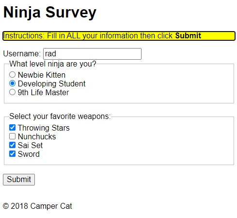
Use tabindex to Specify the Order of Keyboard Focus for Several Elements
The tabindex attribute also specifies the exact tab order of elements. This is achieved when the value of the attribute is set to a positive number of 1 or higher.
Setting a tabindex="1" will bring keyboard focus to that element first. Then it cycles through the sequence of specified tabindex values (2, 3, etc.), before moving to default and tabindex="0" items.
It’s important to note that when the tab order is set this way, it overrides the default order (which uses the HTML source). This may confuse users who are expecting to start navigation from the top of the page. This technique may be necessary in some circumstances, but in terms of accessibility, take care before applying it.
<div tabindex="1">I get keyboard focus, and I get it first!</div>

<div tabindex="2">I get keyboard focus, and I get it second!</div>
Responsive Web Design Principles
Media Queries
Media Queries consist of a media type, and if that media type matches the type of device the document is displayed on, the styles are applied. You can have as many selectors and styles inside your media query as you want.
Here’s an example of a media query that returns the content when the device’s width is less than or equal to 100px, and another example that returns the content when the device’s height is more than or equal to 350px:
@media (max-width: 100px) {
  /* CSS Rules */
}

@media (min-height: 350px) {
  /* CSS Rules */
}
@media (min-width: 576px) {
  .container {
    max-width: 540px;
  }
}

@media (min-width: 768px) {
  .container {
    max-width: 720px;
  }
}
The CSS inside the media query is applied only if the media type matches that of the device being used.
You can also define media queries for landscape (when width > height) and portrait (height > width) modes:
@media (orientation: landscape) {
}

@media (orientation: portrait) {
}
Also, you want to always make sure that media queries comes after what you are overwriting. So, if you’re overwriting a <p> tag, makes sure you place the media queries after styling the selector <p> tag:
p {
  color: #3e4147;
  font-family: "Arvo", serif;
  font-size: 1rem;
  font-weight: 400;
  margin-bottom: 2em;
}

@media (min-width: 600px) {
  p {
    font-size: 1.25rem;
  }
}

@media (min-width: 800px) {
  p {
    font-size: 1.5rem;
    line-height: 1.5;
  }
}
Also, when you design a website for mobiles devices in mind, start by using min-width, otherwise, if you intend to use it mostly on desktops then on mobile, start by using max-width:
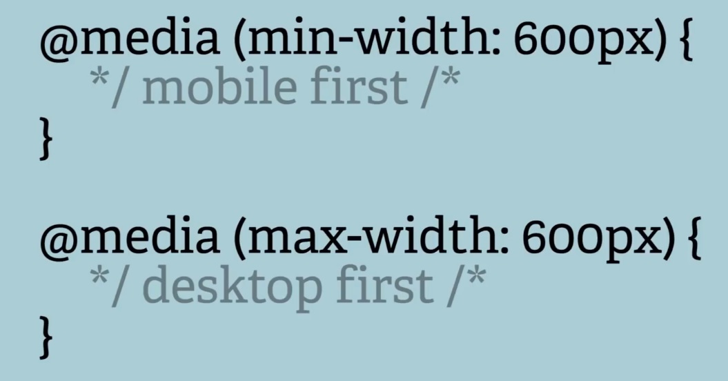
/* Extra small devices (phones, 600px and down) */
@media only screen and (max-width: 600px) {
  ...;
}

/* Small devices (portrait tablets and large phones, 600px and up) */
@media only screen and (min-width: 600px) {
  ...;
}

/* Medium devices (landscape tablets, 768px and up) */
@media only screen and (min-width: 768px) {
  ...;
}

/* Large devices (laptops/desktops, 992px and up) */
@media only screen and (min-width: 992px) {
  ...;
}

/* Extra large devices (large laptops and desktops, 1200px and up) */
@media only screen and (min-width: 1200px) {
  ...;
}
| Value | Description |
|---|---|
| all | Used for all media type devices |
| Used for printers | |
| screen | Used for computer screens, tablets, smart-phones etc. |
| speech | Used for screen readers that “reads” the page out loud |
Other resources on Media Queries:
- CSS Media Queries Tutorial for Responsive Design - Adrian Twarog Youtube
- 1h11m Microsoft Homepage Clone - CSS Grid, Flex & Media Queries - Traversy Media
-
[2h Build a Responsive Website HTML, CSS Grid, Flexbox & More - Traversy Media](https://youtu.be/p0bGHP-PXD4) - w3schools Media Queries examples for nav bard and menus
- w3schools Media Queries examples for Responsive Web Design
Make images responsive
Making images responsive with CSS is actually very simple. You just need to add these properties to an image:
img {
  max-width: 100%;
  height: auto;
}
The max-width of 100% will make sure the image is never wider than the container it is in, and the height of auto will make the image keep its original aspect ratio.
Viewport units for responsive typography
Instead of using em or px to size text, you can use viewport units for responsive typography. Viewport units, like percentages, are relative units, but they are based off different items. Viewport units are relative to the viewport dimensions (width or height) of a device, and percentages are relative to the size of the parent container element.
The four different viewport units are:
vw(viewport width):10vwwould be 10% of the viewport’s width.vh(viewport height):3vhwould be 3% of the viewport’s height.vmin(viewport minimum):70vminwould be 70% of the viewport’s smaller dimension (height or width).vmax(viewport maximum):100vmaxwould be 100% of the viewport’s bigger dimension (height or width).
Here is an example that sets a body tag to 30% of the viewport’s width.
body {
  width: 30vw;
}
Another example:
<style>
  h2 {
    width: 80vw;
  }
  p {
    width: 75vmin;
  }
</style>

<h2>Importantus Ipsum</h2>
<p>
  Lorem ipsum dolor sit amet, consectetur adipiscing elit. Vivamus quis tempus
  massa. Aenean erat nisl, gravida vel vestibulum cursus, interdum sit amet
  lectus. Sed sit amet quam nibh. Suspendisse quis tincidunt nulla. In hac
  habitasse platea dictumst. Ut sit amet pretium nisl. Vivamus vel mi sem.
  Aenean sit amet consectetur sem. Suspendisse pretium, purus et gravida
  consequat, nunc ligula ultricies diam, at aliquet velit libero a dui.
</p>
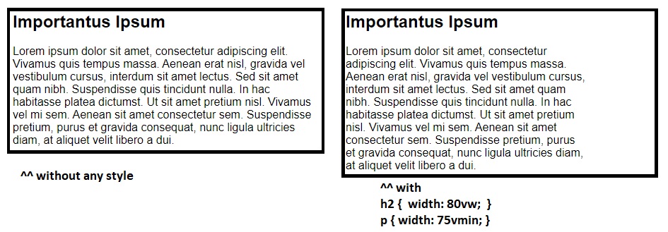
Or, another example:
<style>
div {
  margin: 0 auto 0 auto;
  max-width: 80vmin;
}
</style>
That looks like this for both mobile and desktop:
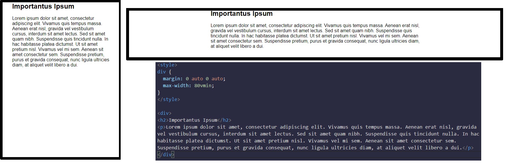
More on viewport from sitepoint.com
CSS Flexbox
website’s User Interface (“UI”) has two components. First, there are the visual elements, such as colors, fonts, and images. Second, there is the placement or positioning of those elements. In Responsive Web Design, a UI layout must accommodate many different browsers and devices accessing the content.
CSS3 introduced Flexible Boxes, or flexbox, to create page layouts for a dynamic UI. It is a layout mode that arranges elements in a predictable way for different screen sizes and browsers. While somewhat new, all popular modern browsers support flexbox.
Usually Flexbox is always used with items (div, ul, etc.) within a container class(div, nav, etc.), eg:
<div class="flex-container">
  <div>1</div>
  <div>2</div>
  <div>3</div>
</div>

<style>
  .flex-container {
    display: flex; /* by default items will be aligned horizontally */
  }
  .flex-container div {
    background-color: DodgerBlue;
    color: white;
    width: 100px;
    margin: 10px;
    text-align: center;
  }
</style>
Flexbox container
flex-direction: - defines in which direction the container wants to stack the flex items
flex-direction: column; /* stacks the flex items vertically (from top to bottom) */
flex-direction: column-reverse; /* stacks the flex items vertically (but from bottom to top) */
flex-direction: row; /* (default) stacks the flex items horizontally (from left to right) */
flex-direction: row-reverse; /* stacks the flex items horizontally (but from right to left) */
flex-wrap: - specifies whether the flex items should wrap or not
flex-wrap: wrap /* specifies that the flex items will wrap if necessary */
flex-wrap: nowrap /* specifies that the flex items will not wrap (this is default) */
flex-wrap: wrap-reverse /* specifies that the flexible items will wrap if necessary, in reverse order */
flex-flow: property is a shorthand property for setting both the flex-direction and flex-wrap properties
flex-flow: row wrap;
justify-content: - property that is used to align/move the flex items horizontally (for rows)
justify-content: center /* aligns the flex items at the center of the container */
justify-content: flex-start /* aligns the flex items at the beginning of the container (this is default) */
justify-content: flex-end /* aligns the flex items at the end of the container */
justify-content: space-around /* displays the flex items with space before, between, and after the lines */
justify-content: space-between /* displays the flex items with space between the lines */
justify-content: space-evenly
align-items: - property is used to align/move the flex items vertically (for rows)
align-items: center /* aligns the flex items in the middle of the container */
align-items: flex-start /* aligns the flex items at the top of the container */
align-items: flex-end /* aligns the flex items at the bottom of the container */
align-items: stretch /* stretches the flex items to fill the container (this is default) */
align-items: baseline /* aligns the flex items such as their baselines aligns */
align-content: - property used to align the flex lines
align-content: space-between /* displays the flex lines with equal space between them */
align-content: space-around /* displays the flex lines with space before, between, and after them */
align-content: stretch /* stretches the flex lines to take up the remaining space (this is default) */
align-content: center /* displays display the flex lines in the middle of the container */
align-content: flex-start /* displays the flex lines at the start of the container */
align-content: flex-end /* displays the flex lines at the end of the container */
Example for Perfect Centering (horizontally and vertically):
.flex-container {
  display: flex;
  height: 300px;
  justify-content: center;
  align-items: center;
}
Flexbox items
flex-shrink: - property that specifies how much a flex item will shrink relative to the rest of the flex items
The flex-shrink property takes numbers as values. The higher the number, the more it will shrink compared to the other items in the container. For example, if one item has a flex-shrink value of 1 and the other has a flex-shrink value of 3, the one with the value of 3 will shrink three times as much as the other.
#item-1 {
  flex-shrink: 1;
}

#item-2 {
  flex-shrink: 2;
}
flex-grow: - property that specifies how much a flex item will grow relative to the rest of the flex items
The opposite of flex-shrink is the flex-grow property. Recall that flex-shrink controls the size of the items when the container shrinks. The flex-grow property controls the size of items when the parent container expands.
#item-1 {
  flex-grow: 1;
}

#item-2 {
  flex-grow: 2;
}
flex-basis: - property that specifies the initial length of a flex item (values in px or %)
The flex-basis property specifies the initial size of the item before CSS makes adjustments with flex-shrink or flex-grow. The units used by the flex-basis property are the same as other size properties (px, em, %, etc.). The value auto sizes items based on the content.
#box-1 {
  background-color: dodgerblue;
  height: 200px;
  flex-basis: 10em;
}

#box-2 {
  background-color: orangered;
  height: 200px;
  flex-basis: 20em;
}
flex: property is a shorthand property for the flex-grow, flex-shrink, and flex-basis properties
flex: 1 0 10px;will set the item toflex-grow: 1;,flex-shrink: 0;, andflex-basis: 10px;.- the default property settings are
flex: 0 1 auto; - if it’s set to
1:flex: 1;, the items will grow and shrink automatically to the size of container
order: - property that specifies the order of the flex items
The order property is used to tell CSS the order of how flex items appear in the flex container. By default, items will appear in the same order they come in the source HTML. The property takes numbers as values, and negative numbers can be used.
#item-1 {
  order: 2;
}

#item-2 {
  order: 1;
}
align-self: - property that specifies the alignment for the selected item inside the flexible container. This property overrides the default alignment set by the container’s align-items property
This property allows you to adjust each item’s alignment individually, instead of setting them all at once. This is useful since other common adjustment techniques using the CSS properties float, clear, and vertical-align do not work on flex items. align-self accepts the same values as align-items and will override any value set by the align-items property.
#box-1 {
  background-color: dodgerblue;
  align-self: center;
  height: 200px;
  width: 200px;
}

#box-2 {
  background-color: orangered;
  align-self: flex-end;
  height: 200px;
  width: 200px;
}
Complete Example of a Twitter Card using Flexbox
<style>
  body {
    font-family: Arial, sans-serif;
  }
  header,
  footer {
    display: flex;
    flex-direction: row;
  }
  header .profile-thumbnail {
    width: 50px;
    height: 50px;
    border-radius: 4px;
  }
  header .profile-name {
    display: flex;
    flex-direction: column;
    justify-content: center;
    margin-left: 10px;
  }
  header .follow-btn {
    display: flex;
    align-items: center;
    margin: 0 0 0 auto;
  }
  header .follow-btn button {
    border: 0;
    border-radius: 3px;
    padding: 5px;
  }
  header h3,
  header h4 {
    display: flex;
    margin: 0;
  }
  #inner p {
    margin-bottom: 10px;
    font-size: 20px;
  }
  #inner hr {
    margin: 20px 0;
    border-style: solid;
    opacity: 0.1;
  }
  footer .stats {
    display: flex;
    font-size: 15px;
  }
  footer .stats strong {
    font-size: 18px;
  }
  footer .stats .likes {
    margin-left: 10px;
  }
  footer .cta {
    margin-left: auto;
  }
  footer .cta button {
    border: 0;
    background: transparent;
  }
</style>
<header>
  <img
    src="https://freecodecamp.s3.amazonaws.com/quincy-/twitterResponsiveFCC-photo.jpg"
    alt="Quincy Larson's profile picture"
    class="profile-thumbnail"
  />
  <div class="profile-name">
    <h3>Quincy Larson</h3>
    <h4>@ossia</h4>
  </div>
  <div class="follow-btn">
    <button>Follow</button>
  </div>
</header>
<div id="inner">
  <p>
    I meet so many people who are in search of that one trick that will help
    them work smart. Even if you work smart, you still have to work hard.
  </p>
  <span class="date">1:32 PM - 12 Jan 2018</span>
  <hr />
</div>
<footer>
  <div class="stats">
    <div class="Retweets"><strong>107</strong> Retweets</div>
    <div class="likes"><strong>431</strong> Likes</div>
  </div>
  <div class="cta">
    <button class="share-btn">Share</button>
    <button class="retweet-btn">Retweet</button>
    <button class="like-btn">Like</button>
  </div>
</footer>
CSS Grid
https://www.freecodecamp.org/learn/responsive-web-design/css-grid/
<style>
  .d1 {
    background: LightSkyBlue;
  }
  .d2 {
    background: LightSalmon;
  }
  .d3 {
    background: PaleTurquoise;
  }
  .d4 {
    background: LightPink;
  }
  .d5 {
    background: PaleGreen;
  }

  .container {
    font-size: 40px;
    width: 100%;
    display: grid;
  }
</style>

<div class="container">
  <div class="d1">1</div>
  <div class="d2">2</div>
  <div class="d3">3</div>
  <div class="d4">4</div>
  <div class="d5">5</div>
</div>
Grid Resources:
- https://learncssgrid.com/
- https://css-tricks.com/snippets/css/complete-guide-grid/
- https://www.freecodecamp.org/news/intro-to-css-grid-layout/ article
- https://gridbyexample.com/examples/
Create Flexible Layouts Using auto-fill
The repeat function comes with an option called auto-fill. This allows you to automatically insert as many rows or columns of your desired size as possible depending on the size of the container. You can create flexible layouts when combining auto-fill with minmax, like this:
.container {
  grid-template-columns: repeat(auto-fill, minmax(60px, 1fr));
}
When the container changes size, this setup keeps inserting 60px columns and stretching them until it can insert another one. Note: If your container can’t fit all your items on one row, it will move them down to a new one.
Create Flexible Layouts Using auto-fit
auto-fit works almost identically to auto-fill. The only difference is that when the container’s size exceeds the size of all the items combined, auto-fill keeps inserting empty rows or columns and pushes your items to the side, while auto-fit collapses those empty rows or columns and stretches your items to fit the size of the container.
Note: If your container can’t fit all your items on one row, it will move them down to a new one.
.container {
  grid-template-columns: repeat(auto-fit, minmax(60px, 1fr));
}
Use Media Queries to Create Responsive Layouts
CSS Grid can be an easy way to make your site more responsive by using media queries to rearrange grid areas, change dimensions of a grid, and rearrange the placement of items.
In the preview, when the viewport width is 300px or more, the number of columns changes from 1 to 2. The advertisement area then occupies the left column completely.
<style>
  .item1 {
    background: LightSkyBlue;
    grid-area: header;
  }

  .item2 {
    background: LightSalmon;
    grid-area: advert;
  }

  .item3 {
    background: PaleTurquoise;
    grid-area: content;
  }

  .item4 {
    background: lightpink;
    grid-area: footer;
  }

  .container {
    font-size: 1.5em;
    min-height: 300px;
    width: 100%;
    background: LightGray;
    display: grid;
    grid-template-columns: 1fr;
    grid-template-rows: 50px auto 1fr auto;
    grid-gap: 10px;
    grid-template-areas:
      "header"
      "advert"
      "content"
      "footer";
  }

  @media (min-width: 300px) {
    .container {
      grid-template-columns: auto 1fr;
      grid-template-rows: auto 1fr auto;
      grid-template-areas:
        "advert header"
        "advert content"
        "advert footer";
    }
  }

  @media (min-width: 400px) {
    .container {
      grid-template-areas:
        "header header"
        "advert content"
        "footer footer";
    }
  }
</style>

<div class="container">
  <div class="item1">header</div>
  <div class="item2">advert</div>
  <div class="item3">content</div>
  <div class="item4">footer</div>
</div>
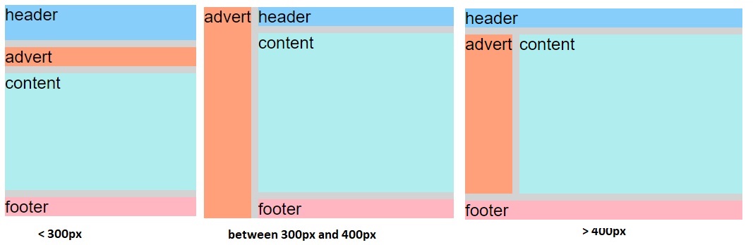
Turning an element into a grid only affects the behavior of its direct descendants. So by turning a direct descendant into a grid, you have a grid within a grid.
For example, by setting the display and grid-template-columns properties of the element with the item3 class, you create a grid within your grid.
<style>
  .container {
    font-size: 1.5em;
    min-height: 300px;
    width: 100%;
    background: LightGray;
    display: grid;
    grid-template-columns: auto 1fr;
    grid-template-rows: auto 1fr auto;
    grid-gap: 10px;
    grid-template-areas:
      "advert header"
      "advert content"
      "advert footer";
  }
  .item1 {
    background: LightSkyBlue;
    grid-area: header;
  }

  .item2 {
    background: LightSalmon;
    grid-area: advert;
  }

  .item3 {
    background: PaleTurquoise;
    grid-area: content;
    display: grid;
    grid-template-columns: auto 1fr;
  }

  .item4 {
    background: lightpink;
    grid-area: footer;
  }

  .itemOne {
    background: PaleGreen;
  }

  .itemTwo {
    background: BlanchedAlmond;
  }
</style>

<div class="container">
  <div class="item1">header</div>
  <div class="item2">advert</div>
  <div class="item3">
    <div class="itemOne">paragraph1</div>
    <div class="itemTwo">paragraph2</div>
  </div>
  <div class="item4">footer</div>
</div>
Responsive Web Design Projects
Build a Tribute Page
My Solution (on codepen.io) - Saturday, January 09, 2021:
Build a Survey Form
Survey Form without any CSS:
<head>
  <title>Survey From</title>
</head>

<body>
  <main class="container">
    <header>
      <h1 id="title">User's Experience Survey Form</h1>
      <p id="description">
        Welcome and thank you for taking your time to help us improve our
        App.<br />We will make sure that every answer counts!
      </p>
    </header>

    <form id="survey-form">
      <div class="form-group">
        <label id="name-label" for="name">Name</label>
        <input
          type="text"
          name="name"
          id="name"
          class="form-control"
          placeholder="Enter your name"
          required
        />
      </div>

      <div class="form-group">
        <label id="email-label" for="email">Email</label>
        <input
          type="email"
          name="email"
          id="email"
          class="form-control"
          placeholder="Enter your email"
          required
        />
      </div>

      <div class="form-group">
        <label id="number-label" for="number"
          >Age<span class="clue">(optional)</span></label
        >
        <input
          type="number"
          name="age"
          id="number"
          min="10"
          max="99"
          class="form-control"
          placeholder="Enter your age"
        />
      </div>

      <div class="form-group">
        <p>Which option best describes your current role?</p>
        <select id="dropdown" name="role" class="form-control" required>
          <option disabled selected value>Select current role</option>
          <option value="student">Student</option>
          <option value="learner">Full Time Learner</option>
          <option value="part-job">Part Time Job</option>
          <option value="job">Full Time Job</option>
          <option value="freelance-job">Freelancer</option>
          <option value="preferNo">Prefer not to say</option>
          <option value="other">Other</option>
        </select>
      </div>

      <div class="form-group">
        <p>How would you rate our service so far?</p>
        <label
          ><input
            name="user-rating"
            value="5"
            type="radio"
            class="input-radio"
            checked
          />5 stars</label
        >
        <label
          ><input
            name="user-rating"
            value="4"
            type="radio"
            class="input-radio"
          />4 stars</label
        >
        <label
          ><input
            name="user-rating"
            value="3"
            type="radio"
            class="input-radio"
          />3 stars</label
        >
        <label
          ><input
            name="user-rating"
            value="2"
            type="radio"
            class="input-radio"
          />2 stars</label
        >
        <label
          ><input
            name="user-rating"
            value="1"
            type="radio"
            class="input-radio"
          />1 star</label
        >
      </div>

      <div class="form-group">
        <p>Would you recommend our service to any of your friends?</p>
        <label>
          <input
            name="user-recommend"
            value="definitely"
            type="radio"
            class="input-radio"
            checked
          />Definitely</label
        >
        <label>
          <input
            name="user-recommend"
            value="maybe"
            type="radio"
            class="input-radio"
          />Maybe</label
        >
        <label
          ><input
            name="user-recommend"
            value="no"
            type="radio"
            class="input-radio"
          />No</label
        >
      </div>

      <div class="form-group">
        <p>
          What would you like to see improved?
          <span class="clue">(Check all that apply)</span>
        </p>

        <label
          ><input
            name="prefer"
            value="front-end-projects"
            type="checkbox"
            class="input-checkbox"
          />Front-end Projects</label
        >
        <label>
          <input
            name="prefer"
            value="back-end-projects"
            type="checkbox"
            class="input-checkbox"
          />Back-end Projects</label
        >
        <label
          ><input
            name="prefer"
            value="data-visualization"
            type="checkbox"
            class="input-checkbox"
          />Data Visualization</label
        >
        <label
          ><input
            name="prefer"
            value="challenges"
            type="checkbox"
            class="input-checkbox"
          />Challenges</label
        >
        <label
          ><input
            name="prefer"
            value="open-source-community"
            type="checkbox"
            class="input-checkbox"
          />Open Source Community</label
        >
        <label
          ><input
            name="prefer"
            value="gitter-help-rooms"
            type="checkbox"
            class="input-checkbox"
          />Gitter help rooms</label
        >
        <label
          ><input
            name="prefer"
            value="videos"
            type="checkbox"
            class="input-checkbox"
          />Videos</label
        >
        <label
          ><input
            name="prefer"
            value="city-meetups"
            type="checkbox"
            class="input-checkbox"
          />City Meetups</label
        >
        <label
          ><input
            name="prefer"
            value="wiki"
            type="checkbox"
            class="input-checkbox"
          />Wiki</label
        >
        <label
          ><input
            name="prefer"
            value="forum"
            type="checkbox"
            class="input-checkbox"
          />Forum</label
        >
        <label
          ><input
            name="prefer"
            value="additional-courses"
            type="checkbox"
            class="input-checkbox"
          />Additional Courses</label
        >
      </div>

      <div class="form-group">
        <p>Any comments or suggestions?</p>
        <textarea
          id="comments"
          class="input-textarea"
          name="comment"
          placeholder="Enter your comment here..."
        ></textarea>
      </div>

      <div class="form-group">
        <button type="submit" id="submit" class="submit-button">Submit</button>
      </div>
    </form>
  </main>
</body>
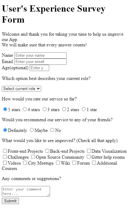
If we import Bootstrap:
<head>
  <title>Survey From</title>
  <link
    rel="stylesheet"
    href="https://stackpath.bootstrapcdn.com/bootstrap/4.3.1/css/bootstrap.min.css"
    integrity="sha384-ggOyR0iXCbMQv3Xipma34MD+dH/1fQ784/j6cY/iJTQUOhcWr7x9JvoRxT2MZw1T"
    crossorigin="anonymous"
  />
</head>
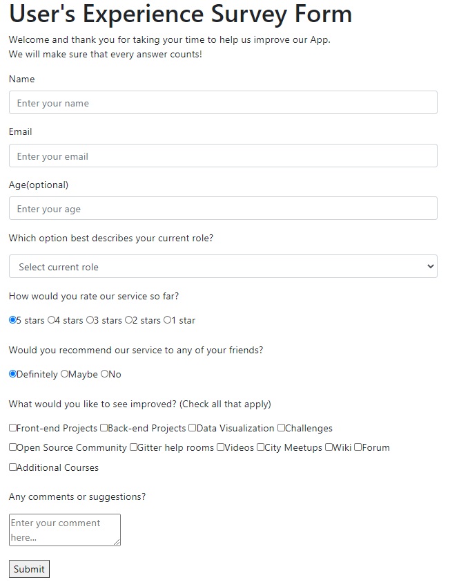
My solution (without Bootstrap) - Saturday, January 09, 2021:
Build a Product Landing Page
HTML5 Starter Template - Boilerplate:
<!DOCTYPE html>
<html lang="en">
  <head>
    <meta charset="utf-8" />
    <meta
      name="viewport"
      content="width=device-width, initial-scale=1, shrink-to-fit=no"
    />

    <title>Product Landing Page</title>
    <meta name="description" content="A mockup of a Product Landing Page" />
    <meta name="author" content="Radu-Alexandru B" />

    <link rel="icon" type="image/x-icon" href="/favicon.ico?" />
    <link rel="apple-touch-icon" href="/favicon.png?" />
    <script src="https://cdn.freecodecamp.org/testable-projects-fcc/v1/bundle.js"></script>
  </head>

  <body>
    <!-- Navigation -->
    <nav></nav>

    <!-- Page Header -->
    <header>
      <h1></h1>
    </header>

    <!-- Main Content -->
    <main class="container">
      <section></section>

      <section></section>
    </main>

    <!-- Footer -->
    <footer></footer>
  </body>
</html>
My Solution:
Technical Documentation Page
Technical Documentation Webpage Challenge Description
freeCodeCamp’s requests/rules for solving these challenges kind of restricts on personally making the projects…
Personal Portfolio Webpage
Personal Portfolio Webpage Challenge Description
Nice, pretty polished result (Wednesday, January 13, 2021, 00:14)